|
|
Post by bixaorellana on Jun 21, 2014 5:47:54 GMT
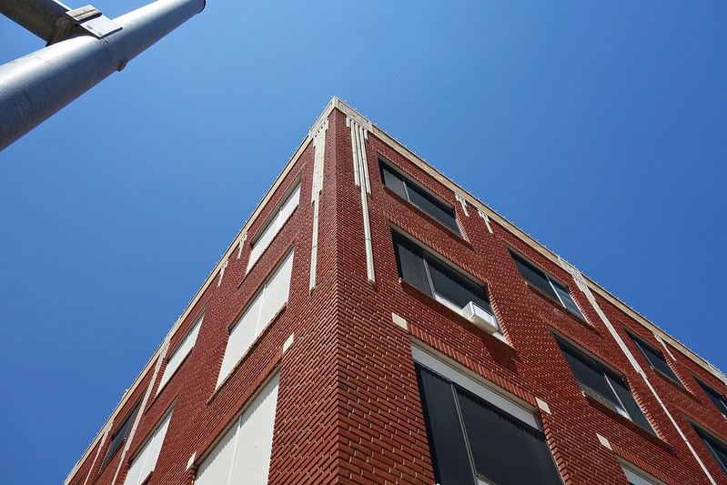
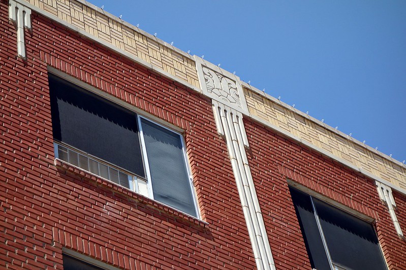
This building must have been built sometime after January 1931, when large parts of the city of Oaxaca were reduced to rubble by an earthquake. I never noticed the true name of it until I took this picture, since everyone calls it "the Bambi building" for the bakery that occupies a good portion of it. The far corner in this picture is rounded, as are so many buildings in this style. 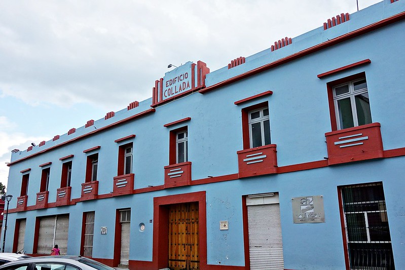 |
|
|
|
Post by Deleted on Jun 21, 2014 10:18:23 GMT
COOL Bixa!!
Thanks for resurrecting this site in true form!!
( Don't you think that the colors are all wrong? Painted a more vibrant pastel would so enhance this building IMHO).
|
|
|
|
Post by bixaorellana on Jun 21, 2014 15:09:41 GMT
Supposedly all the buildings in the Centro Histórico have to conform to a historically accurate group of colors. However, I've heard that money in the right hands can get that spectrum much closer to your particular taste.  There are definitely buildings in the historic district that make you say "surely not!" in terms of accuracy. Be that as it may, if the colors are supposed to conform to some kind of colonial period standard, I suppose that would explain why a modern building such as this lacks zingy Miami-style colors. And really, pastels in this climate tend to look wimpy and faded. Also, the building would probably stand out too much in relation to its neighbors. The Miami colors are truly gorgeous in that humidity-softened climate. Since the city was planned around that look, there is no opportunity for an art-deco building to look jarring next to a 18th century one. I tried googling to see if there was a particular spectrum for the 20s & 30s beyond what we automatically associate with the era, i.e., that of Miami and Los Angeles. I wasn't successful, but I did find this sad news item: link |
|
|
|
Post by Deleted on Jun 22, 2014 17:48:10 GMT
Oh, that's a shame. It was a magnificent building.
|
|
|
|
Post by mickthecactus on Feb 17, 2015 8:45:50 GMT
|
|
|
|
Post by Deleted on Feb 17, 2015 12:50:03 GMT
That's an interesting article, but it's frustrating that it had so few illustrations.
|
|
|
|
Post by mickthecactus on Feb 18, 2015 8:42:46 GMT
|
|
|
|
Post by mickthecactus on Feb 24, 2015 9:09:02 GMT
|
|
|
|
Post by bixaorellana on Jun 19, 2015 20:00:03 GMT
|
|
|
|
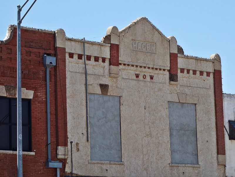
Post by Deleted on Jun 20, 2015 18:30:11 GMT
I really like the W O W but I am pretty sure that it did not originally mean "wow".
|
|
|
|
Post by bixaorellana on Jun 20, 2015 19:29:50 GMT
Could it have been Woodmen of the World? My grandfather was a member & used to get literature from them when I was a kid. I loved looking at it because of the great tombstones W.o.W. used to provide. |
|
|
|
Post by bixaorellana on Nov 4, 2016 0:36:55 GMT
|
|
|
|
Post by Kimby on Nov 16, 2016 1:30:13 GMT
|
|
|
|
Post by bixaorellana on Nov 16, 2016 5:31:45 GMT
That's a shame! Puebla, Mexico ~ 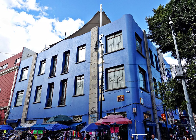 |
|
|
|
Post by mickthecactus on Nov 16, 2016 8:30:16 GMT
Not sure of that colour!
|
|
|
|
Post by bixaorellana on Nov 16, 2016 15:01:20 GMT
It's called "blue".  |
|
|
|
Post by Deleted on Nov 16, 2016 15:45:35 GMT
|
|
|
|
Post by mickthecactus on Dec 29, 2016 13:21:41 GMT
It's called "blue".  More purple to my eyes........ |
|
|
|
Post by Kimby on Jan 10, 2017 18:27:38 GMT
|
|