|
|
Post by tod2 on Aug 23, 2011 14:00:59 GMT
First, the arms of the city of Paris, though. 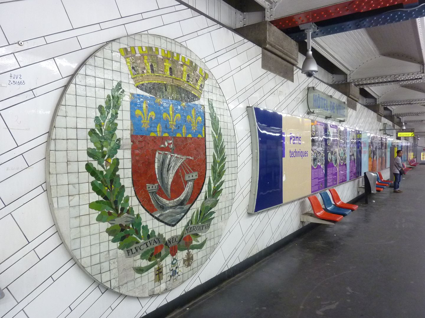 Kerouac, I had my nose deep into my latest read "Paris Discovered" at lunchtime today and was excited to learn this about the coat of arms: "The 'blason' took it's present form in 1942. It helps focus on it's centre, an updated version of the water merchants' simple boat. This stylized vessel of silver rides on equally stylized silver waves and dominates the heraldic escutcheon, whose background is red - a colour intentionally evocative of the city's often-bloody struggles for liberty and Independence. Red is also significant as the colour of Saint Denis - the cathedral where countless generations of French Royalty are buried. Saint-Denis provided the oriflame, the scarlet banner that inspired French armies as they charged into battle, long before the Fleur-DE-Li's came to symbolize French royalty. But by Charles V's day, the Fleur-DE-Li's had become the royal symbol, while blue had become the royal colour. Note the band of golden Fleur's-DE-Li's against the background of blue at the escutcheon's top, where Charles V originally placed it. The escutcheon is wearing a crown - a very peculiar crown, actually, for it has all the markings of a castle, including crenellations along its top, and the outlines of stones across its walls. Symbolism is essential to heraldry, as you have already noticed, and this crown with its five towers symbolizes the ancient city of Paris protected by ramparts. Continuing our exploration, we find some greenery curving gently along the escutcheon's sides. To the right is a laurel branch, while to the left is a branch of oak - surely indications of heroism and strength. From the bottom, as if in vindication, hang three medals conferred on the city of Paris within the past century: the Legion of Honour (centre), the Cross of War (World War I), and the Cross of Liberation (World War II). There is a lot going on here, as befits a coat of arms produced over the course of eight centuries. Do not overlook the motto, 'Fluctuat nee Mergitur', even though it's Latin. Roughly translated, it means that Paris, and the boat that symbolises her, may encounter rough sailing - but she will not sink! I hope others found this as interesting as I did and thank you again for posting the photo  |
|
|
|
Post by nycgirl on Aug 30, 2011 1:21:06 GMT
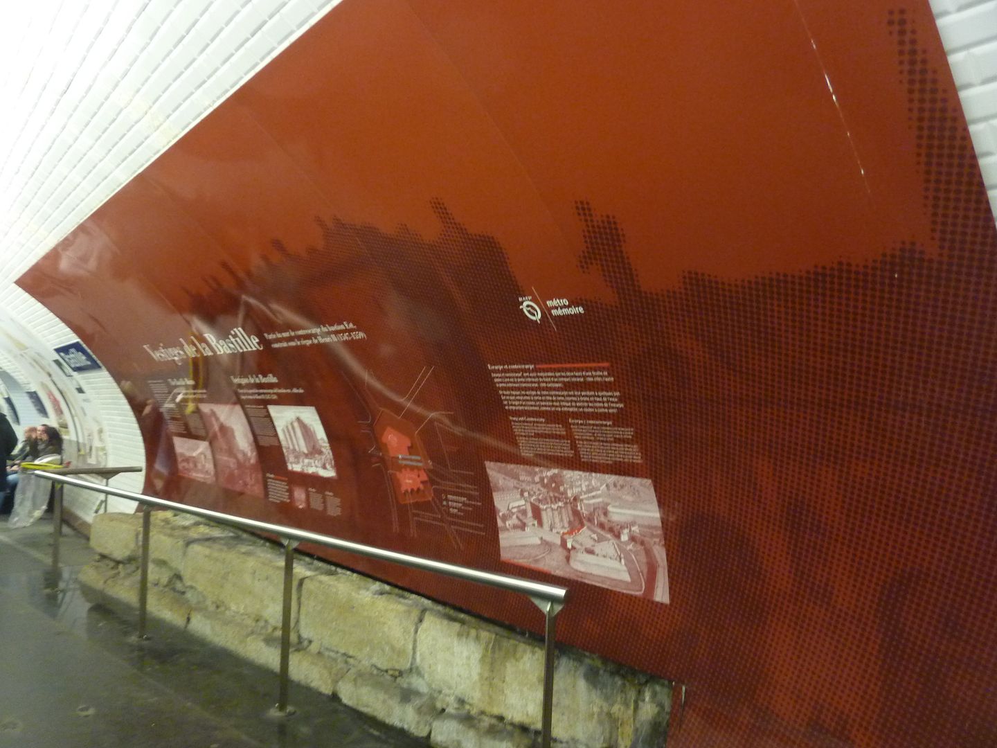
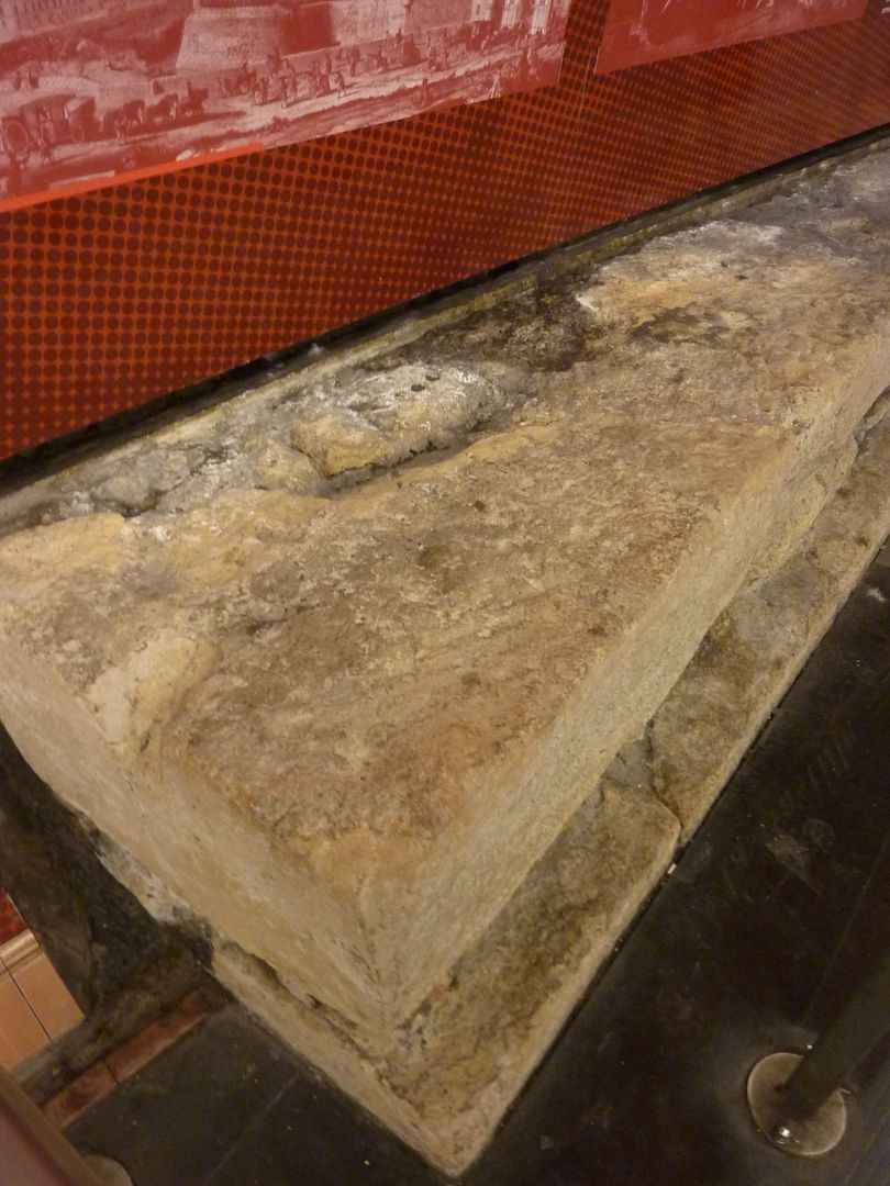
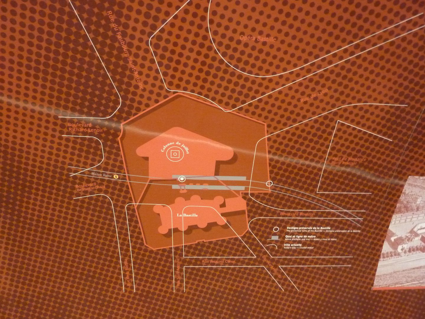
Tod, I think this stuff is interesting, too. Thanks for the history lesson.  Some of these stations are so fascinating. I love the submarine one and the rainforest one. Also the Bastille, with its prison foundations. I think I tried to take the train there once but it was closed at the time. Too bad, I would have liked to check it out. I've been trying to place the faces on the ceiling at the Chaussée d'Antin-La Fayette line 9 station. I recognize Martin Luther King, Picasso, and Edith Piaf, but I don't know the others. Any takers? |
|
|
|
Post by Deleted on Aug 30, 2011 17:06:00 GMT
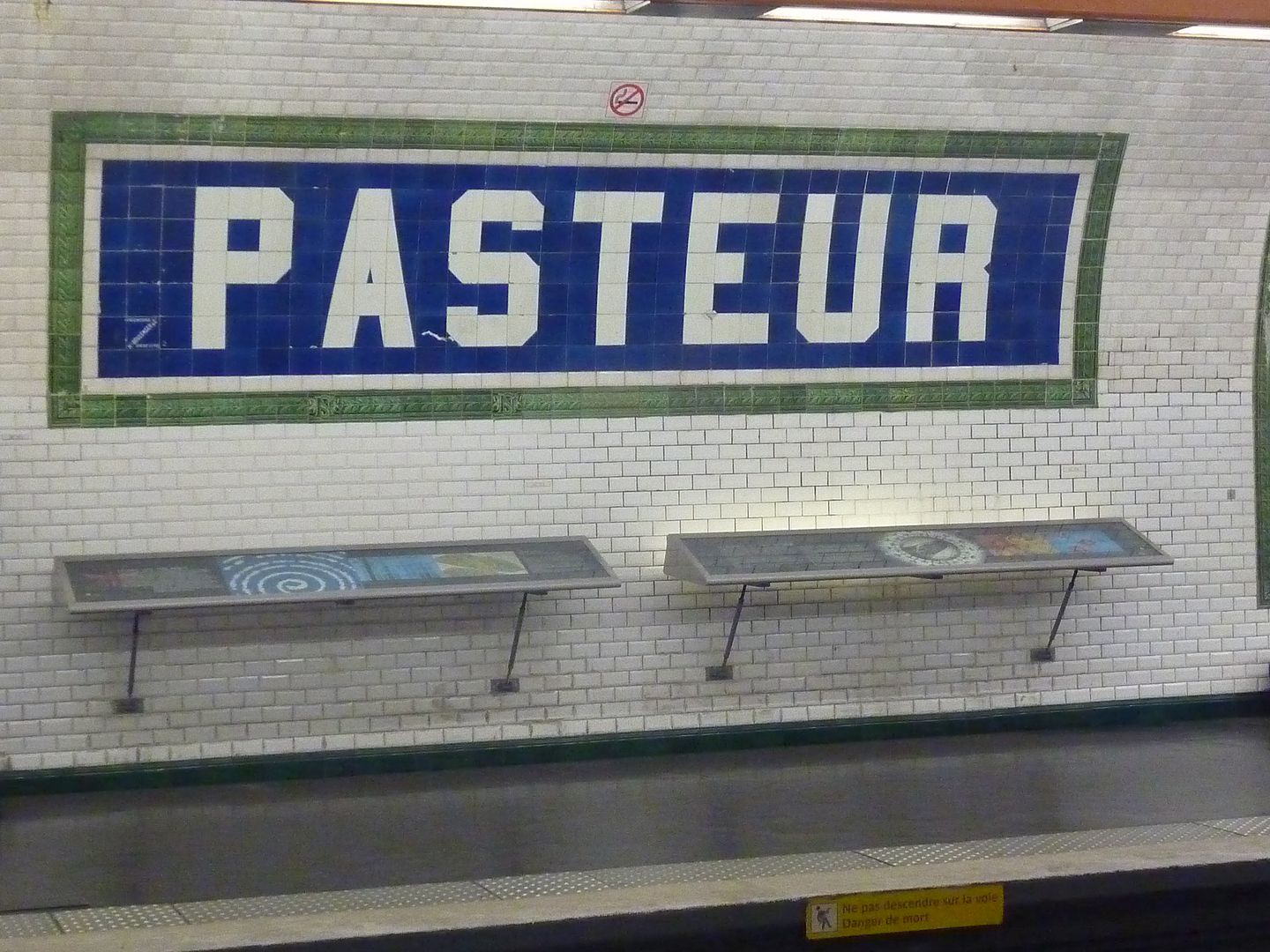
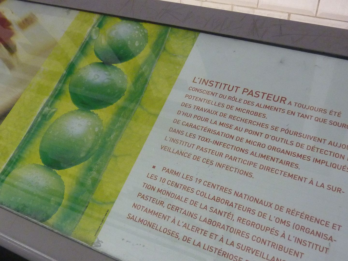
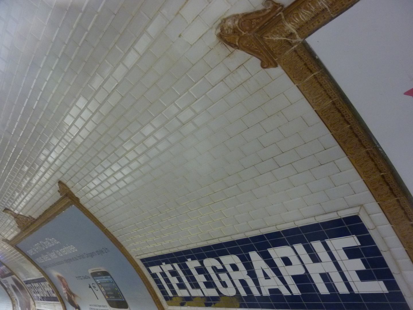
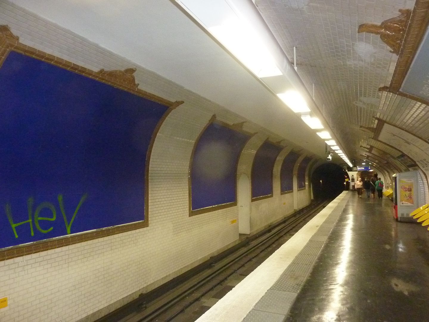
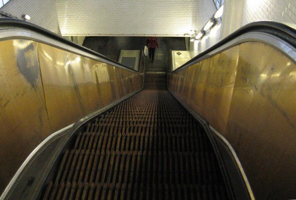
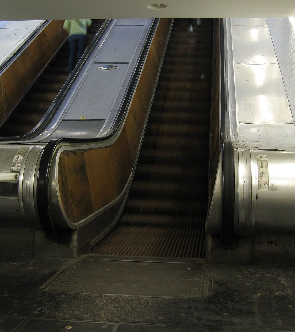
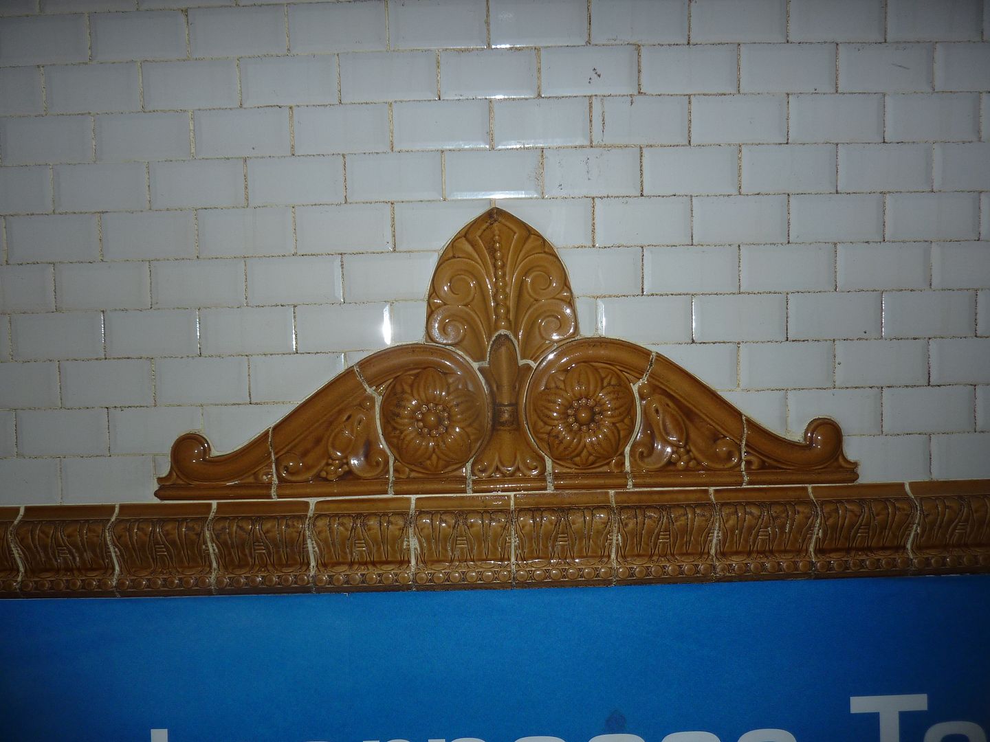
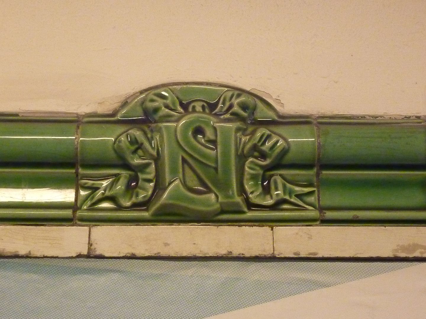
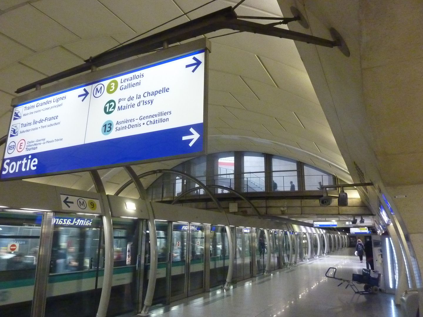
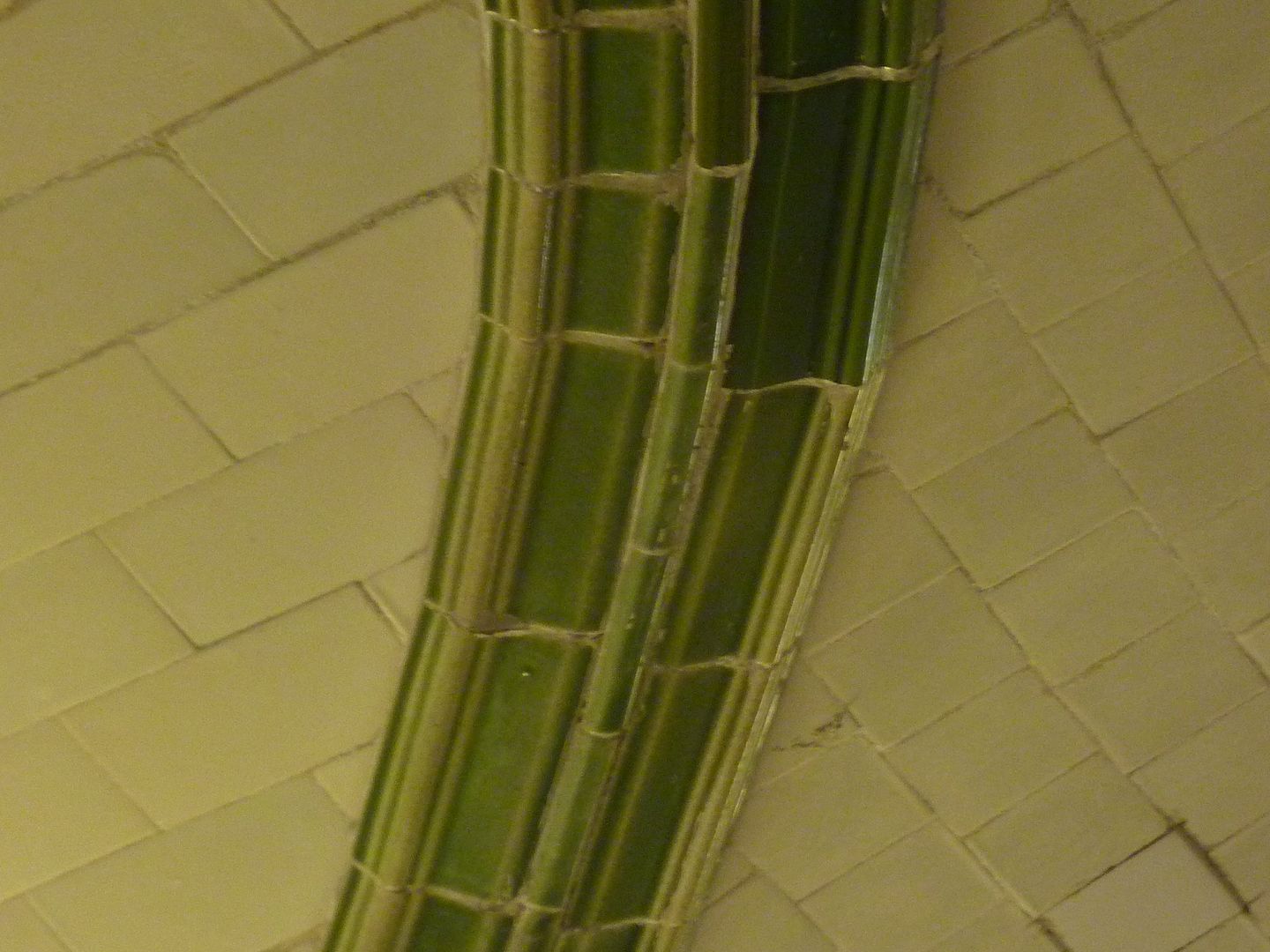
The Pasteur station (line 12) has displays about the Pasteur Institute just upstairs. There was lots of information, but there is so much to say about Pasteur that it is disappointing that there are no displays in the Pasteur station on line 6. Télégraphe (line 11) does not have any historical displays, but it is famous for being the deepest station in Paris. It was used by the German army as the ultimate bomb-proof bunker during WW2. Since it has a reinforcement wall in the middle with inacessible advertising panels like at Liège, I think that some art foundation should propose a decorative project. The stations in this part of Paris are famous for their very long escalators (but that will not impress Londoners who have plenty of escalators just as long). 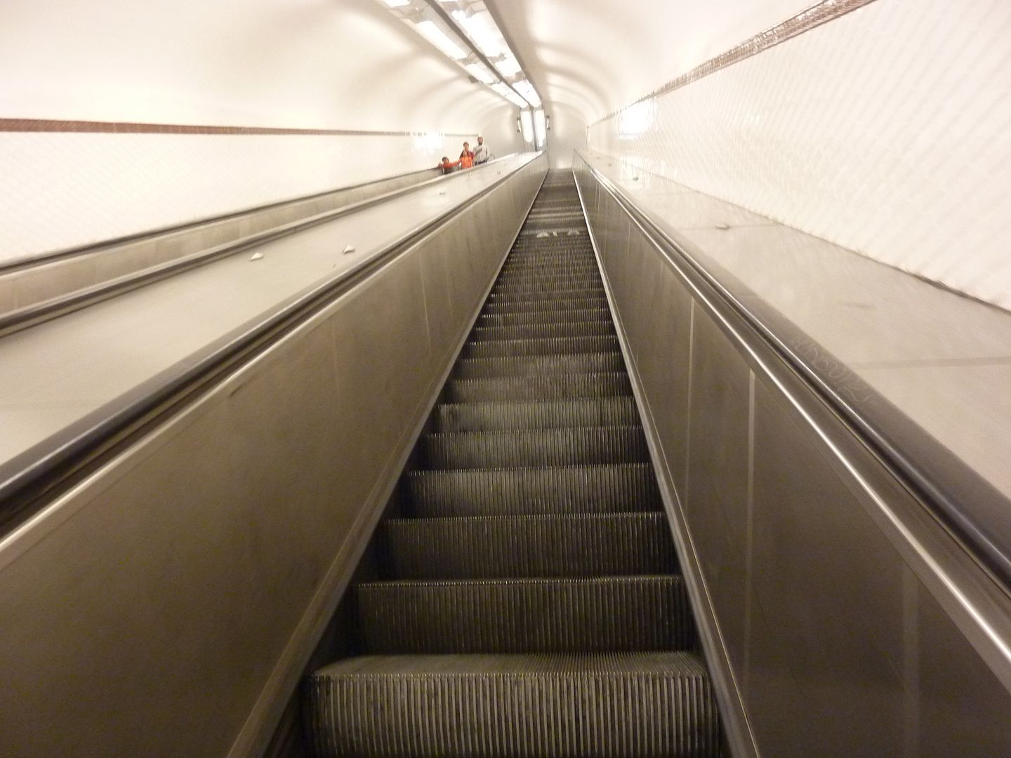 Until late in the last century (the 20th), there were quite a few wooden escalators still in service, particularly in the deepest and busiest stations where escalators had been installed right from the start. Later escalators were all made out of steel of course. Even though these escalators were incredibly sturdy, I'm pretty sure that it was the London King's Cross fire in 1987 which killed 31 people which made both London and Paris get rid of the remaining wooden escalators as quickly as possible. A final thing to notice when you take the metro are the excellent ceramic frames of the old advertising boards. It is easy to notice a major difference in style between the " Métropolitain" frames and the " Nord Sud" frames. The color scheme is always respected as well -- Métropolitain frames are always brown and Nord-Sud frames are always green, even when they are recent replicas. |
|
|
|
Post by Deleted on Sept 27, 2011 10:48:31 GMT
I made a special trip to the Louvre-Rivoli station at lunch to see if they had finally finished the renovations and..... still nothing.  |
|
|
|
Post by Deleted on Sept 27, 2011 14:26:04 GMT
Kerouac, that's too bad about the Louvre station. But I have made a spreadsheet of your recommendations to take with me in October. My fiancé is a public transport architecture nut and you can bet we'll be visiting quite a few of these. Thank you for your fabulous photo essays. Is a book in the works?
|
|
|
|
Post by patricklondon on Sept 28, 2011 19:29:00 GMT
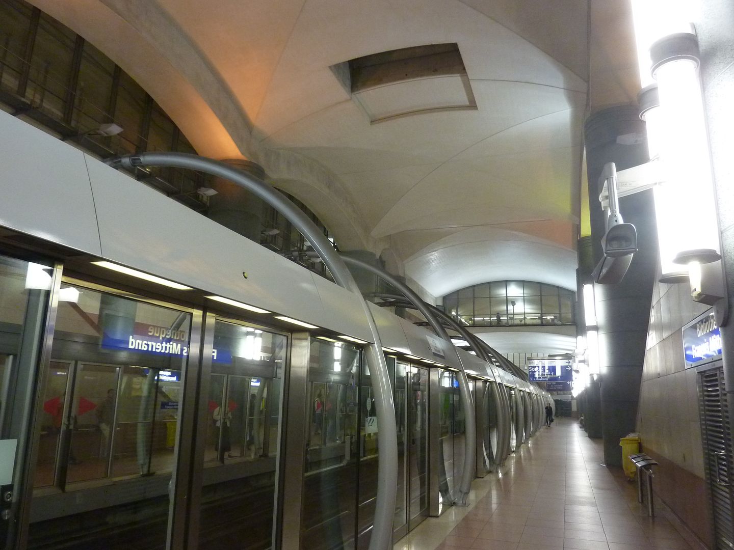
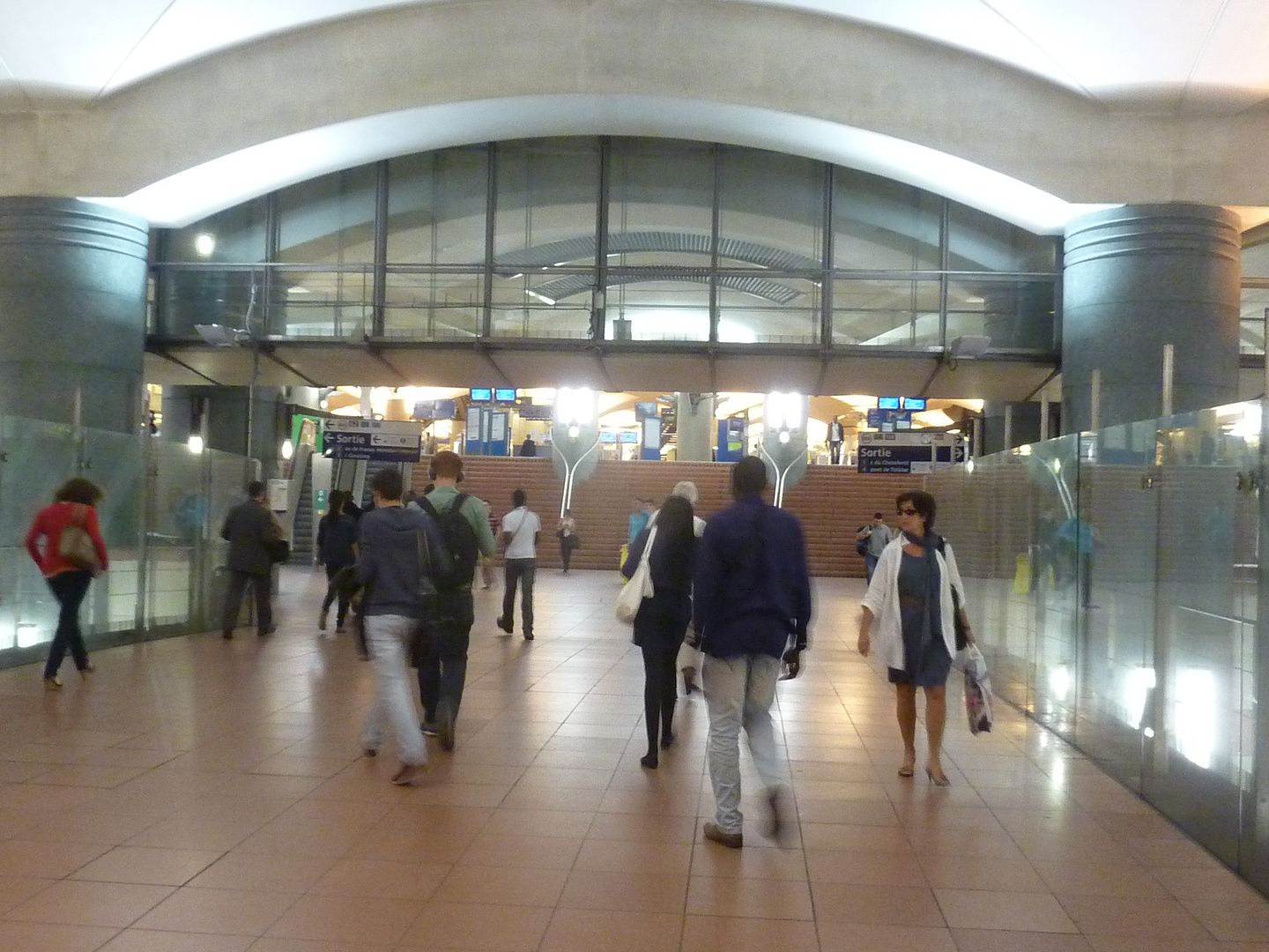
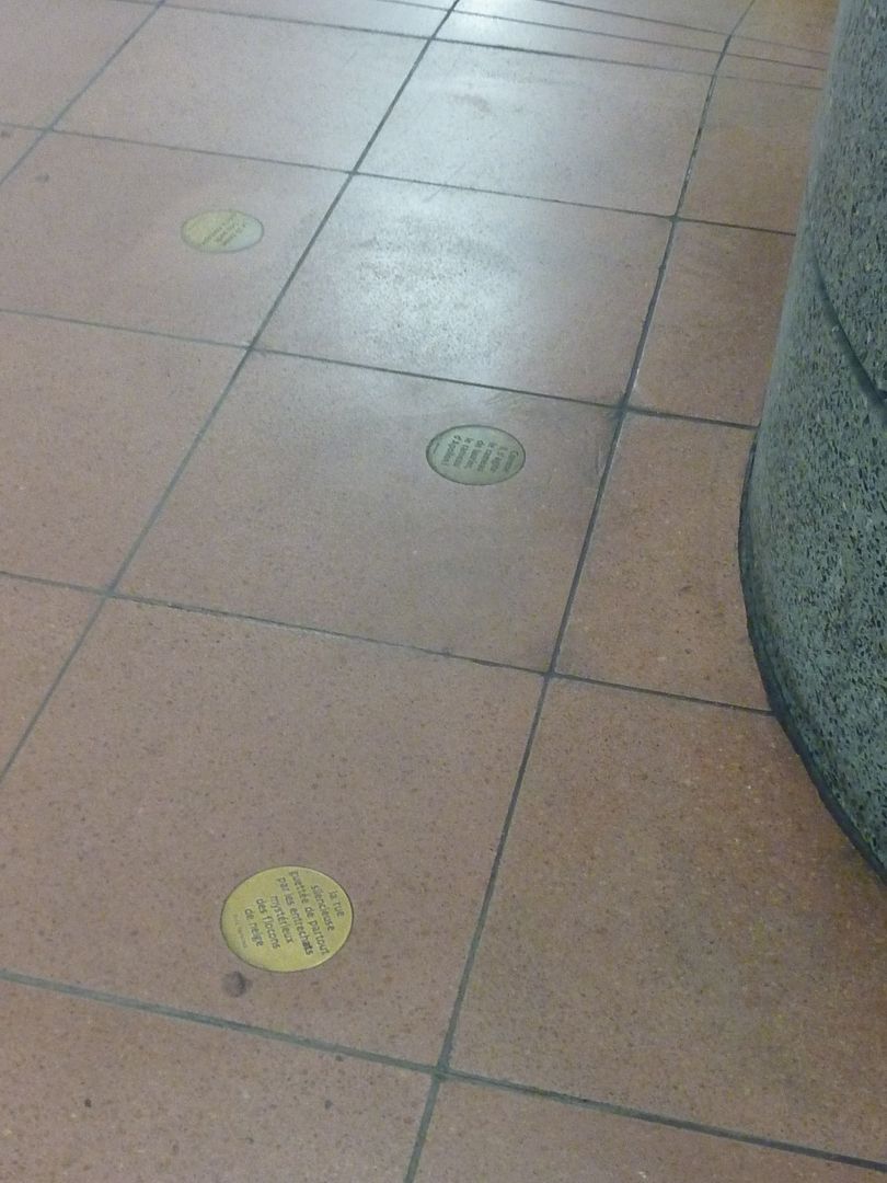
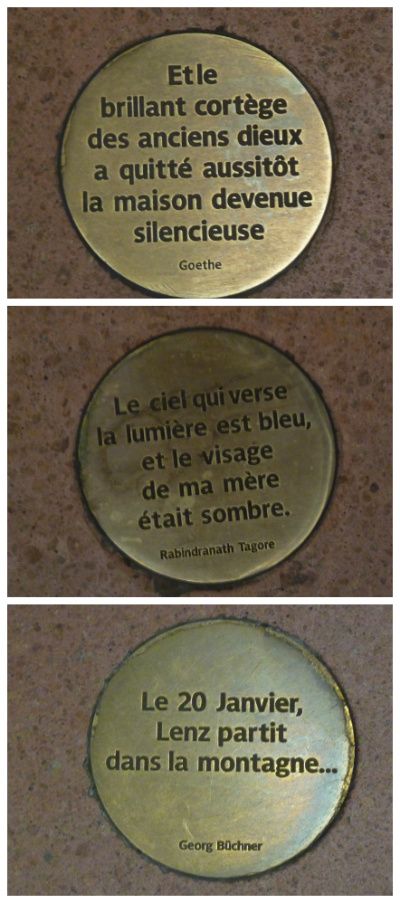
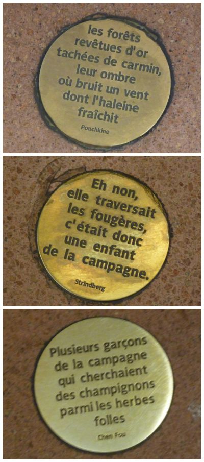
What an eye you have - and what a lot of work to put it all together! We don't have anything like as ambitious in London, though some f the newer stations on the Jubilee Line extension are pretty impressive architecture. The odd thing about the Parisian approach is that you would have thought they wouldn't want people lingering on the platforms (and the trains don't have very long service intervals) and yet there's quite a reading programme there (I still haven't finished reading the Hotel de Ville). One of the most striking stations (to me) is the Bibliotheque Francois Mitterand. As well as its grand concourse and dramatic escalators, I love the little roundels with enigmatic quotations set into the platform surfaces (I don't want to hijack the thread, but you can see an example at www.flickr.com/photos/patricklondon/2786675005/in/set-72157601670143924). |
|
|
|
Post by Deleted on Sept 28, 2011 19:47:42 GMT
Thanks for pointing out Bibiliothèque François Mitterrand, Patrick -- it is indeed a very impressive station, and I have been meaning to add it and also have been sometimes totally blind to it, because even though I use it often, I never linger to examine some of the amazing details. I'll try to make amends next weekend.
|
|
|
|
Post by Deleted on Oct 5, 2011 14:59:46 GMT
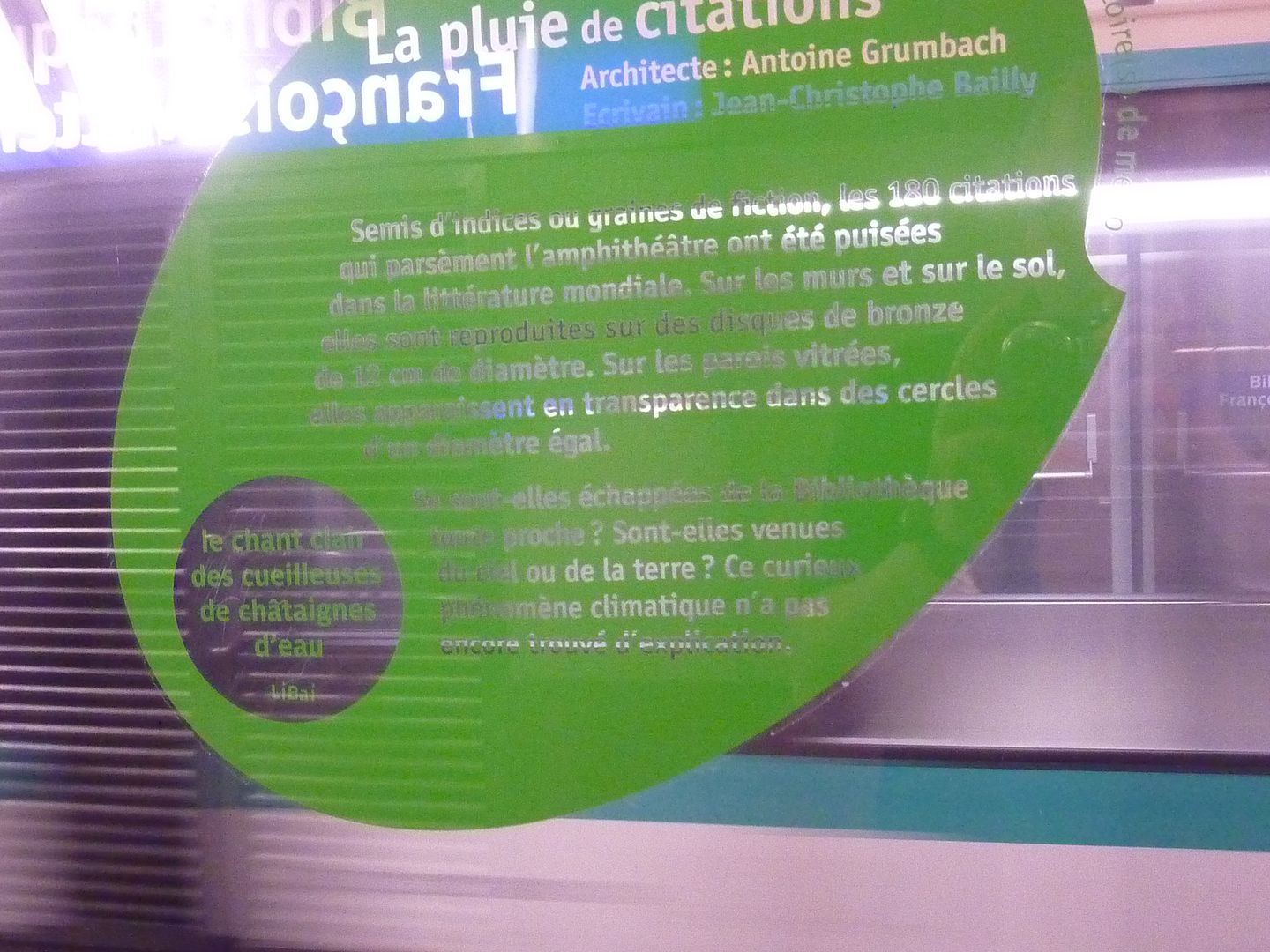
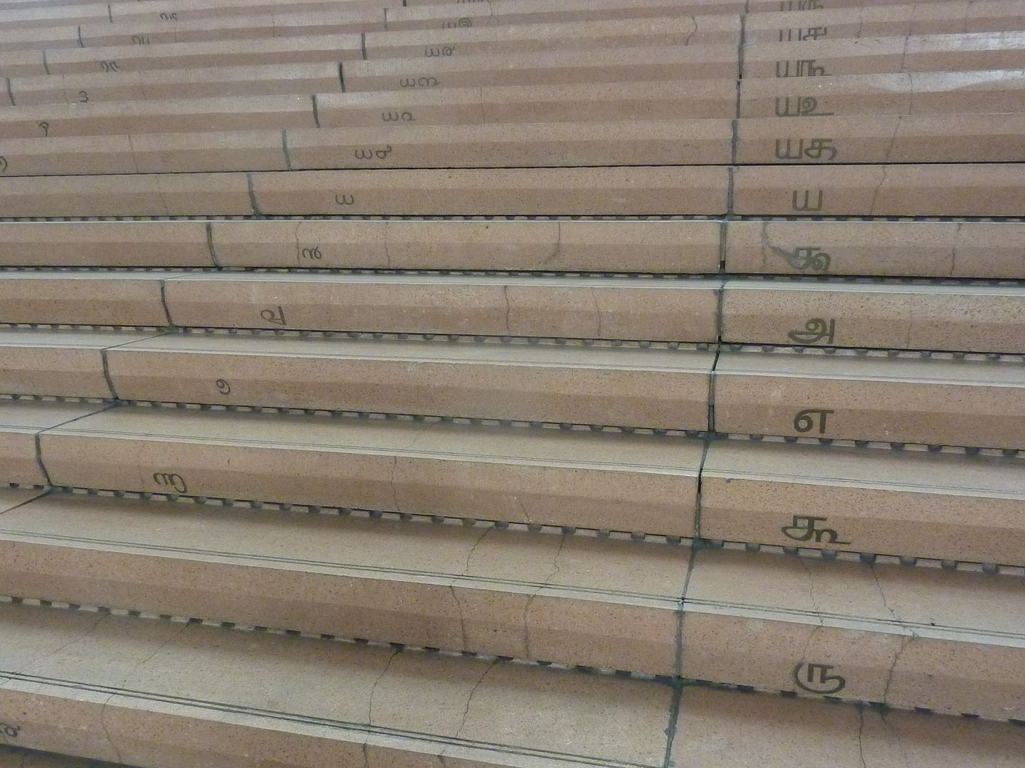
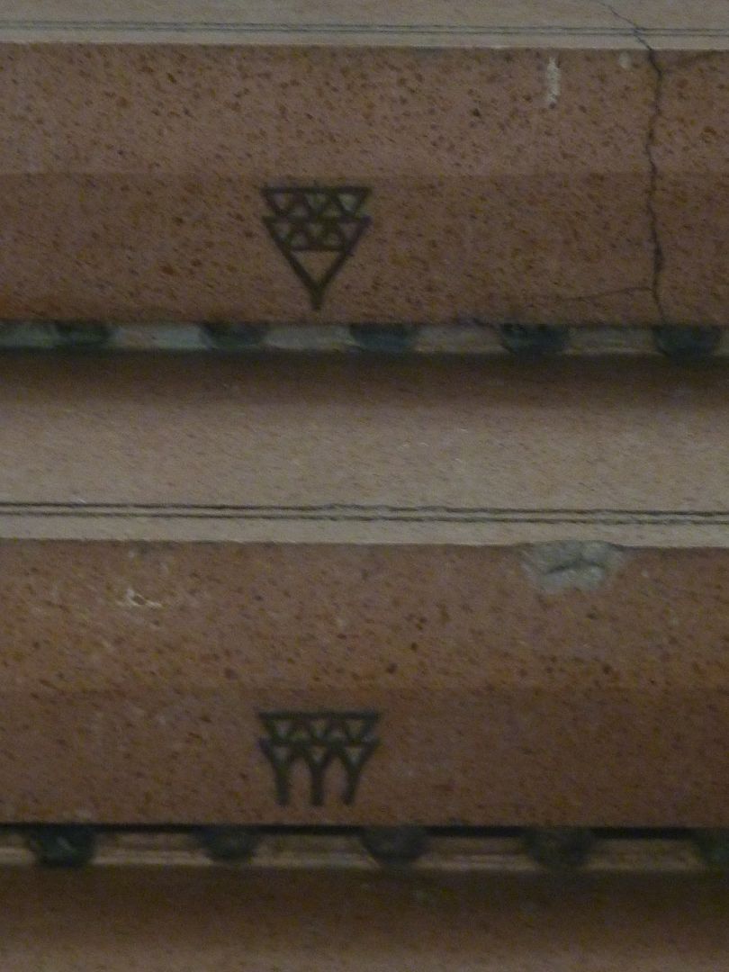
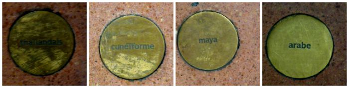
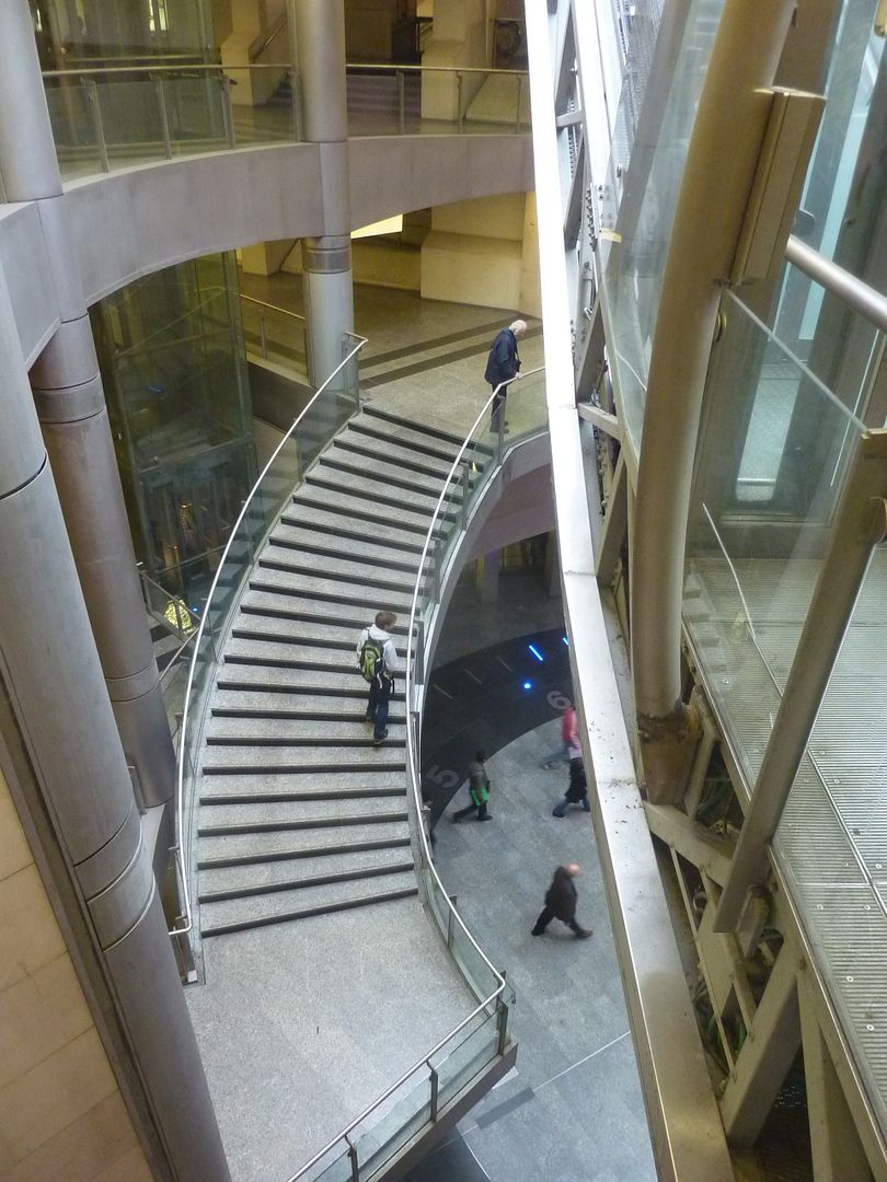
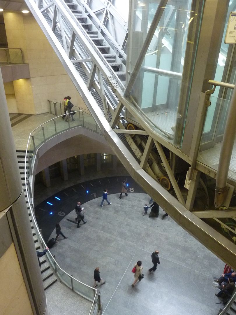
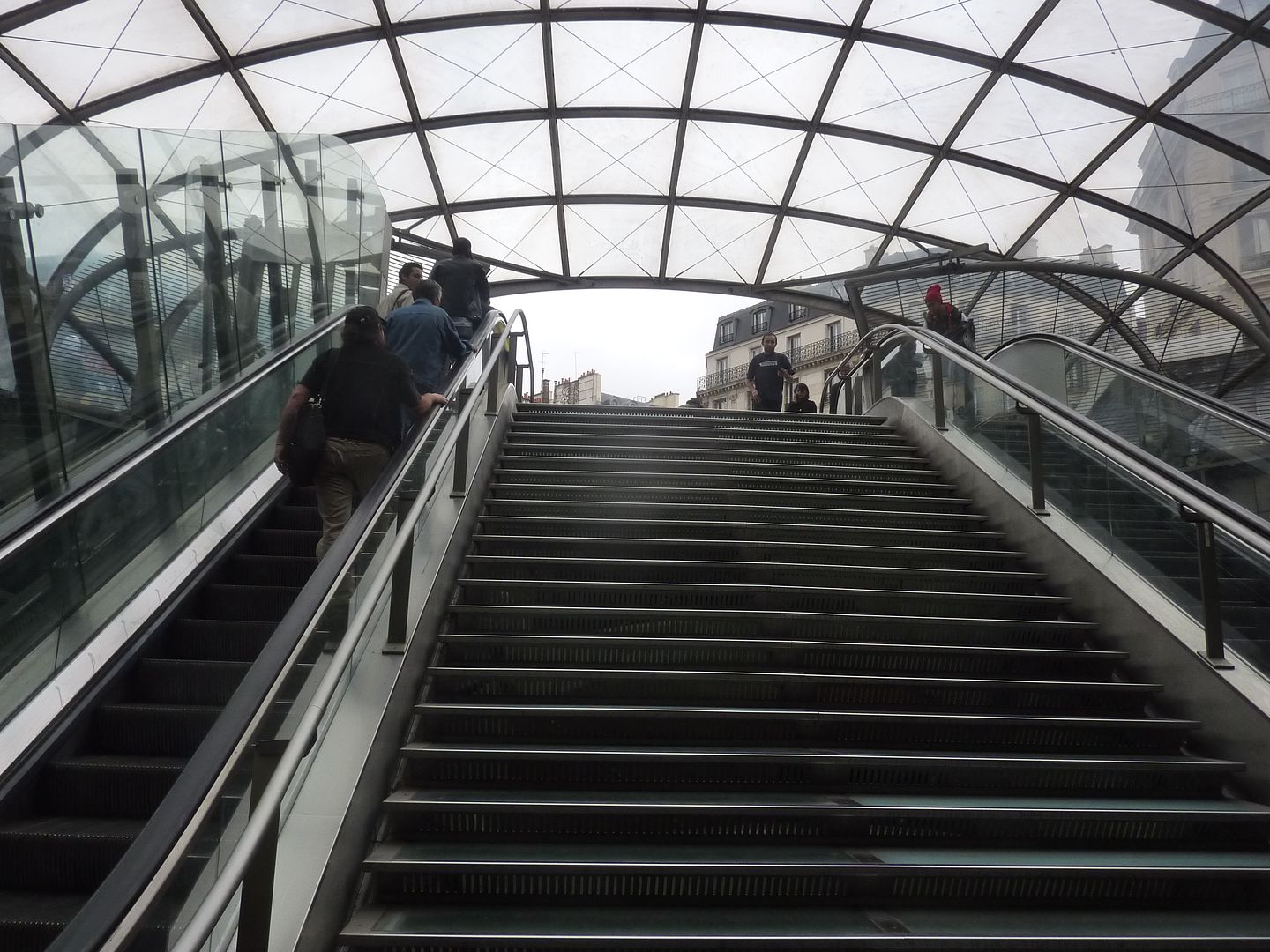
And so here are some pictures of the Bibliothèque François Mitterrand station. It is vastly larger than most stations, even though it just a "normal" metro station connecting to a normal RER station. However, it has both a huge business district and university built on top -- the library is almost just a minor detail. However, incrusted in the floor and walls and even on the glass panels, there are literary quotations from all over the world. Most people probably do not even notice them. |
|
|
|
Post by nycgirl on Oct 5, 2011 15:10:23 GMT
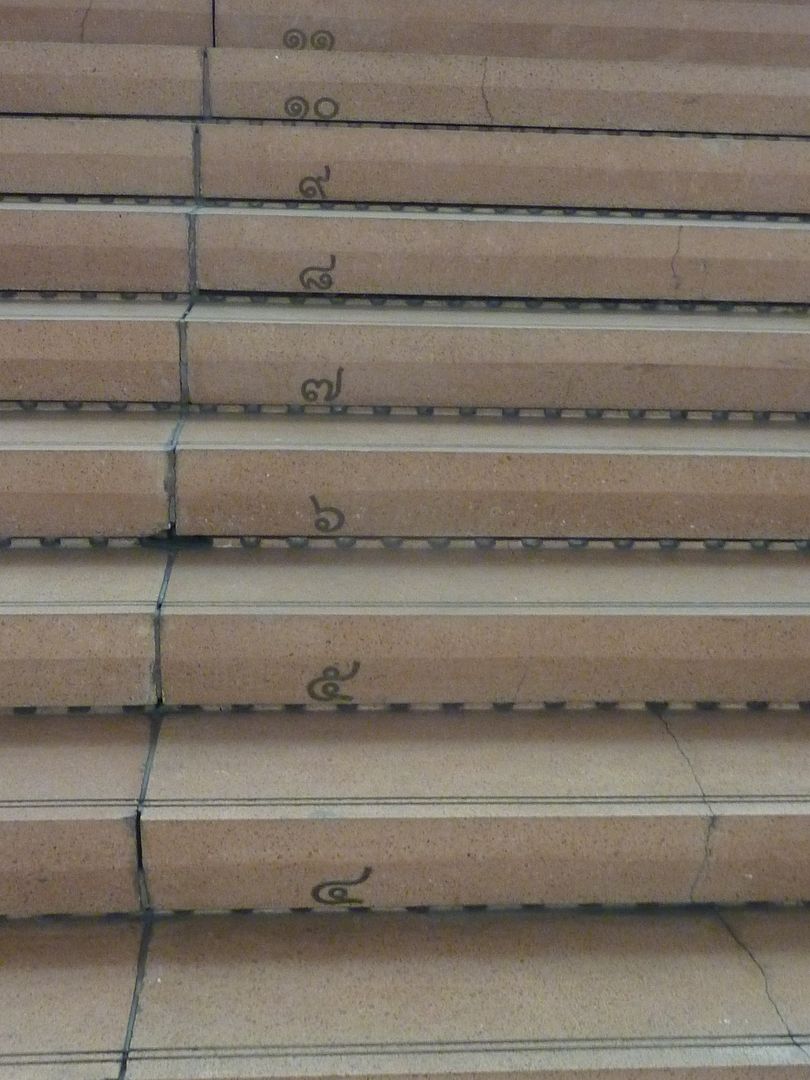
What a lovely station. I especially like the stairs. The different alphabet letters are so pretty.
|
|
|
|
Post by onlymark on Oct 5, 2011 15:52:06 GMT
I bet they hate the fact the Goethe translation is wrong.
|
|
|
|
Post by bjd on Oct 5, 2011 16:37:25 GMT
They probably translated the texts the way they translate movie titles.
|
|
|
|
Post by Deleted on Oct 5, 2011 17:08:36 GMT
They do not translate movie titles. Nor do they do so in any other country. The adapt a title to the local market. I didn't realize that there were still people who did not understand this.
As for literary translations, they are rarely literal, nor should they be.
|
|
|
|
Post by onlymark on Oct 5, 2011 17:47:45 GMT
Is it wrong then? I was only trying to see if someone would bite and check.
What did they adapt the film 'Jaws' to then?
Mâchoires?
|
|
|
|
Post by Deleted on Oct 5, 2011 17:53:16 GMT
It is perfect.
|
|
|
|
Post by lola on Oct 6, 2011 3:12:28 GMT
Very fine, K. Thank you.
|
|
|
|
Post by Deleted on Oct 11, 2011 14:28:57 GMT
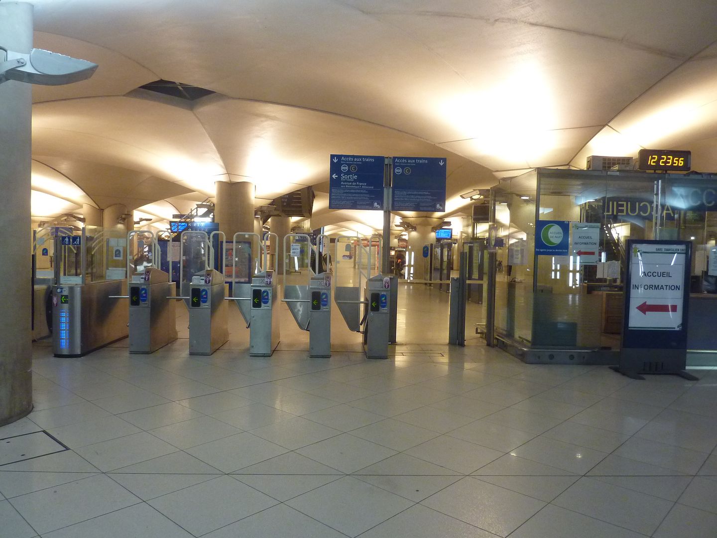
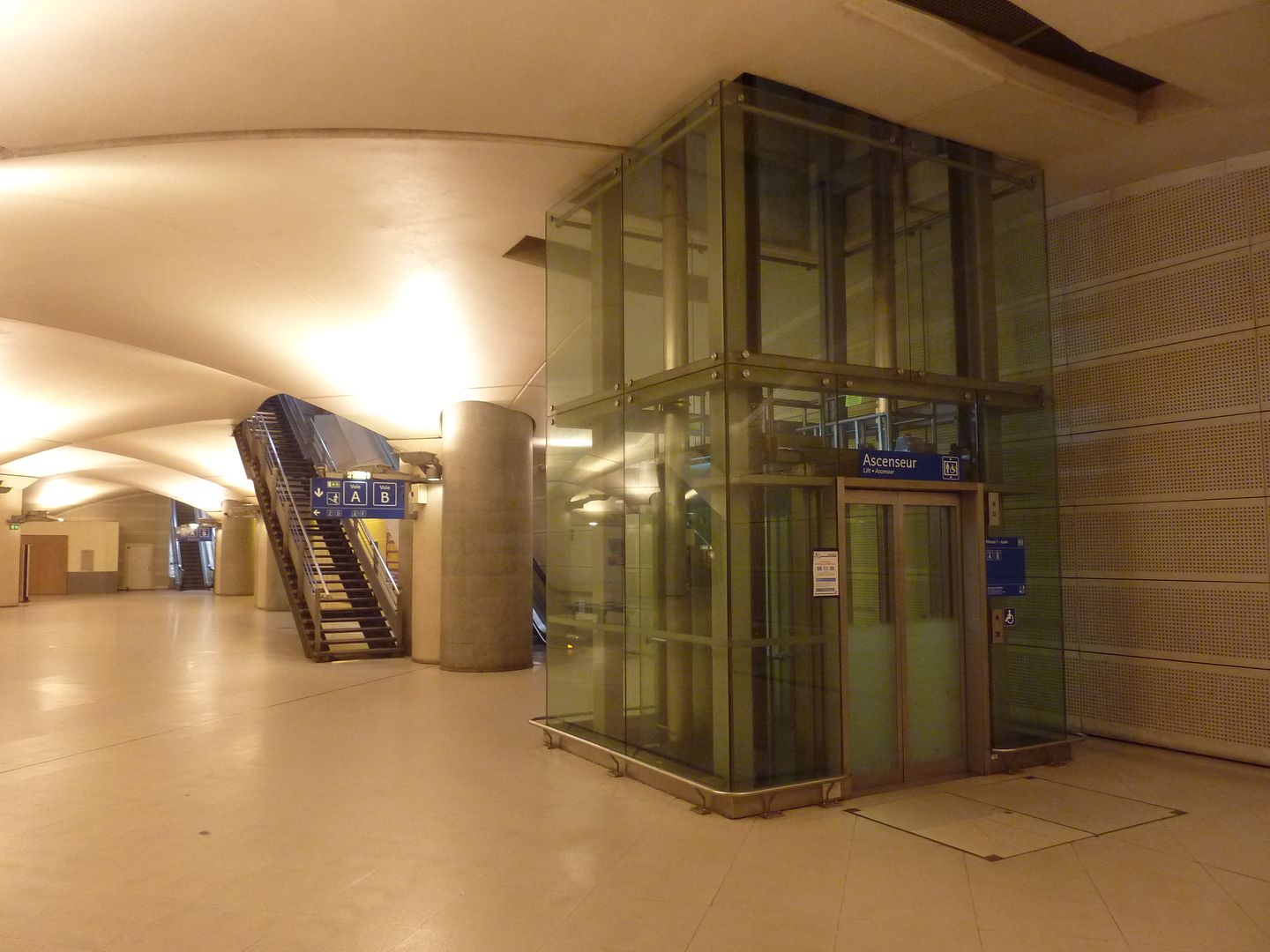
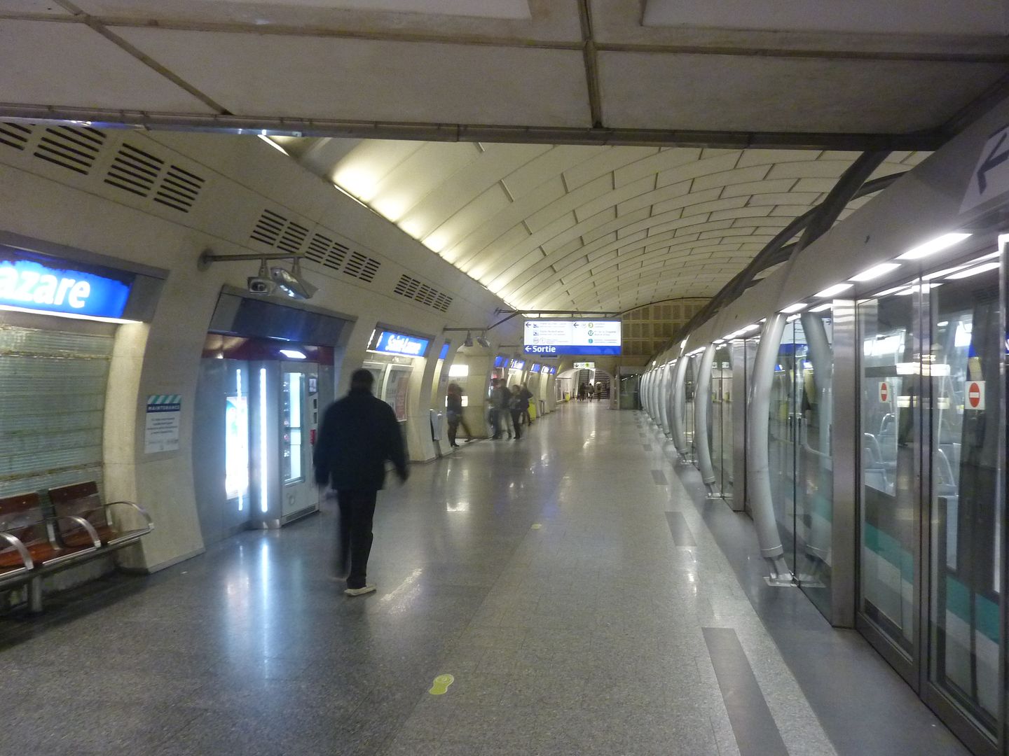
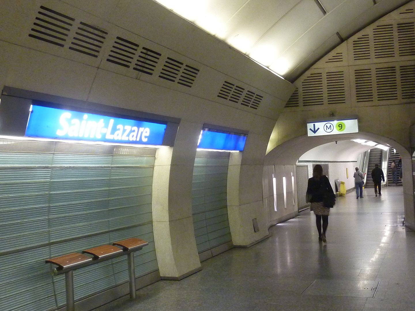
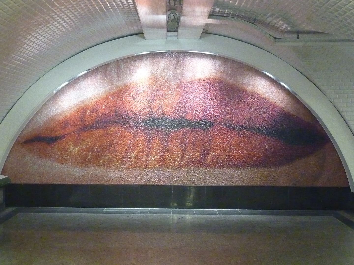
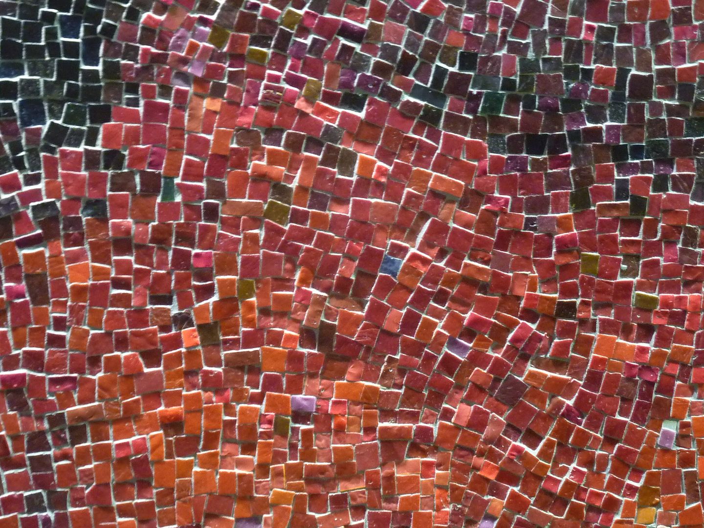
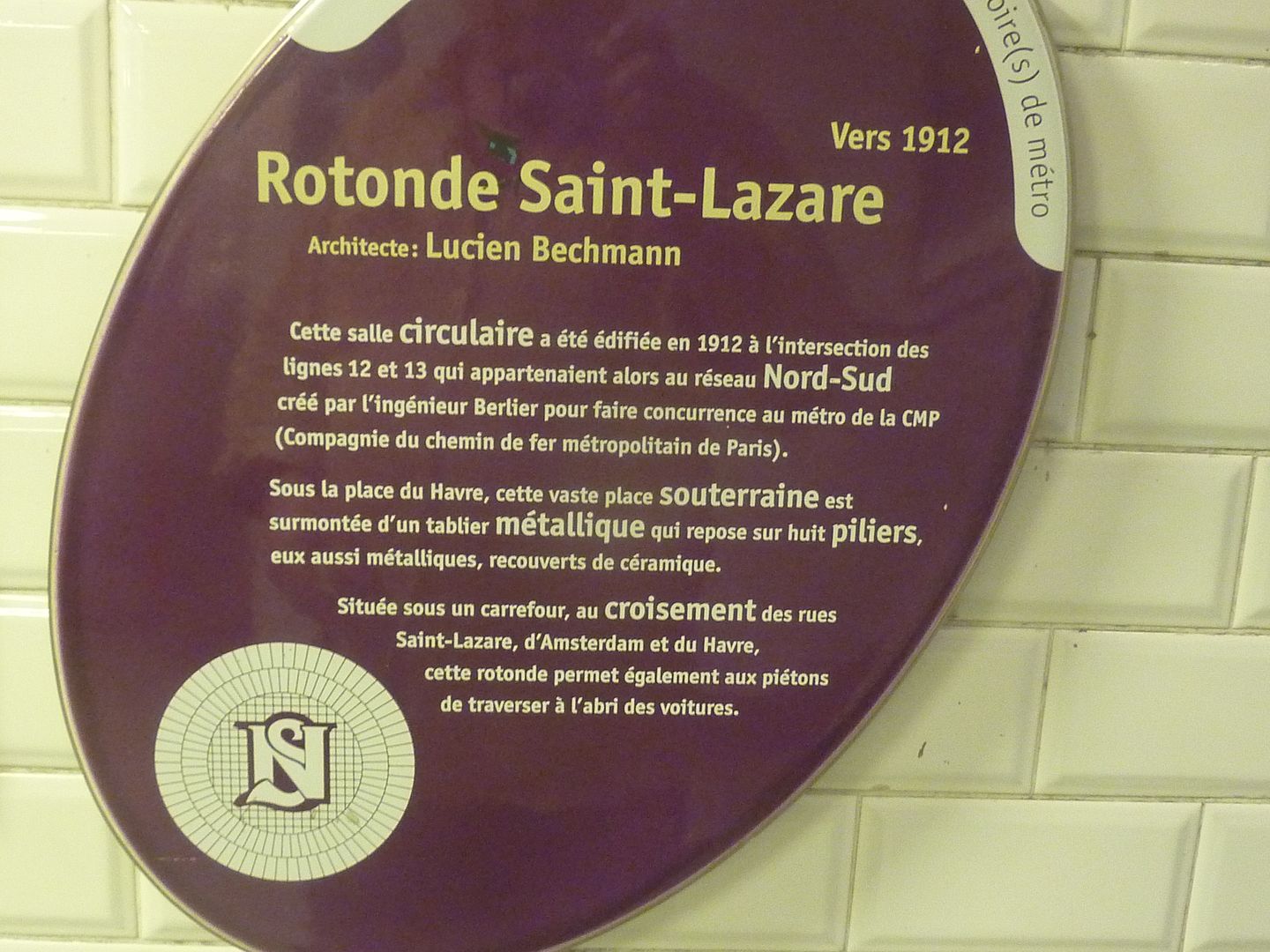
There is a brand new artwork in the metro, just inaugurated last week. Many people will never see it because it is one of the least known connecting corridors in the metro system, linking the Saint Lazare line 14 station to the Saint Augustin line 9 station. This connection does not appear on the metro maps, because Saint Lazare is already too crowded with lines 3, 12 and 13, and they really don't need more people coming through there. Nevertheless, when you arrive at Saint Lazare on line 14, there is a sign indicating where to go. And then you see it. 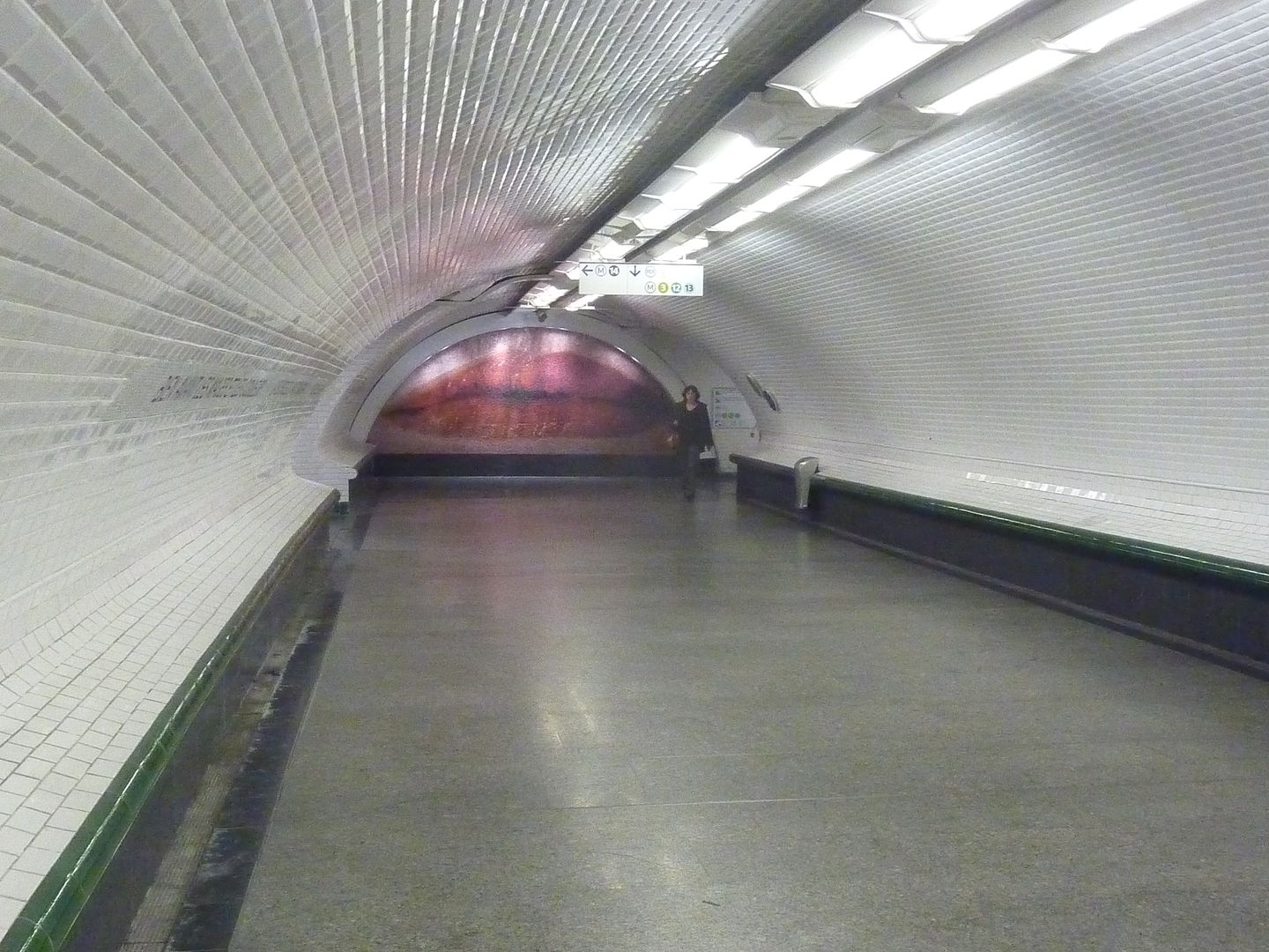 It is a gift from the Montréal metro system to the Paris metro system, which gave Montréal a Guimard entrance at the beginning of the 21st century. This particular artwork is a copy of one that is on the roof of a museum in Montréal. In any case it's a very nice addition to the metro art. The whole Saint Lazare train station is being restructured at the moment -- a three year project -- so there might be other surprises unveiled when all of the new metro corridors are opened. The line 14 area is already quite impressive, just like at Bibilothèque François Mitterrand. I should mention the old part of Saint Lazare as well, though. A hundred years ago, they tried to make the intersection of two Nord-Sud lines (now lines 12 and 13) as fancy as possible with the famous salle de la rotonde. It's just one of the details that I enjoy noticing. |
|
|
|
Post by nycgirl on Oct 12, 2011 21:58:52 GMT
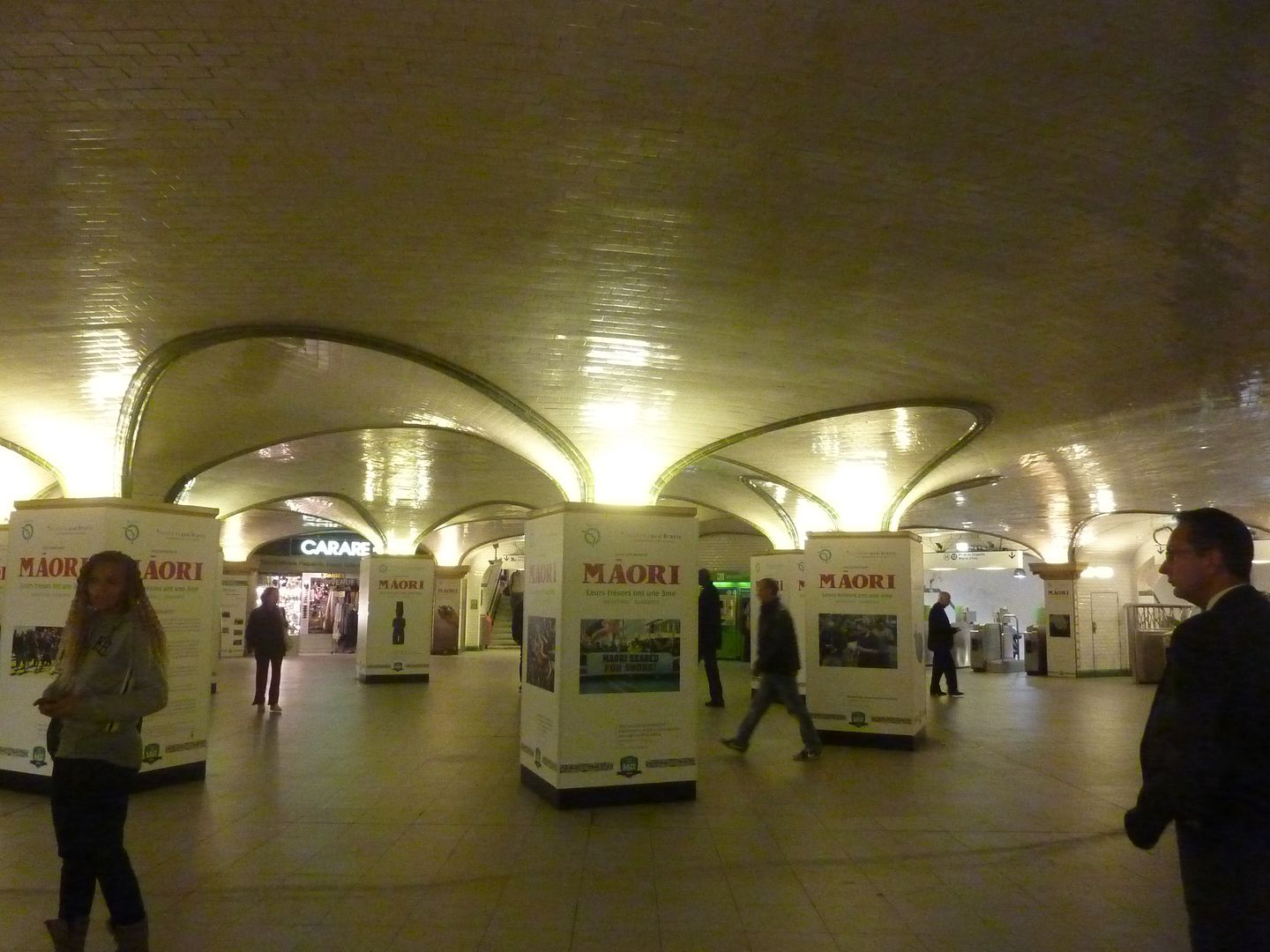
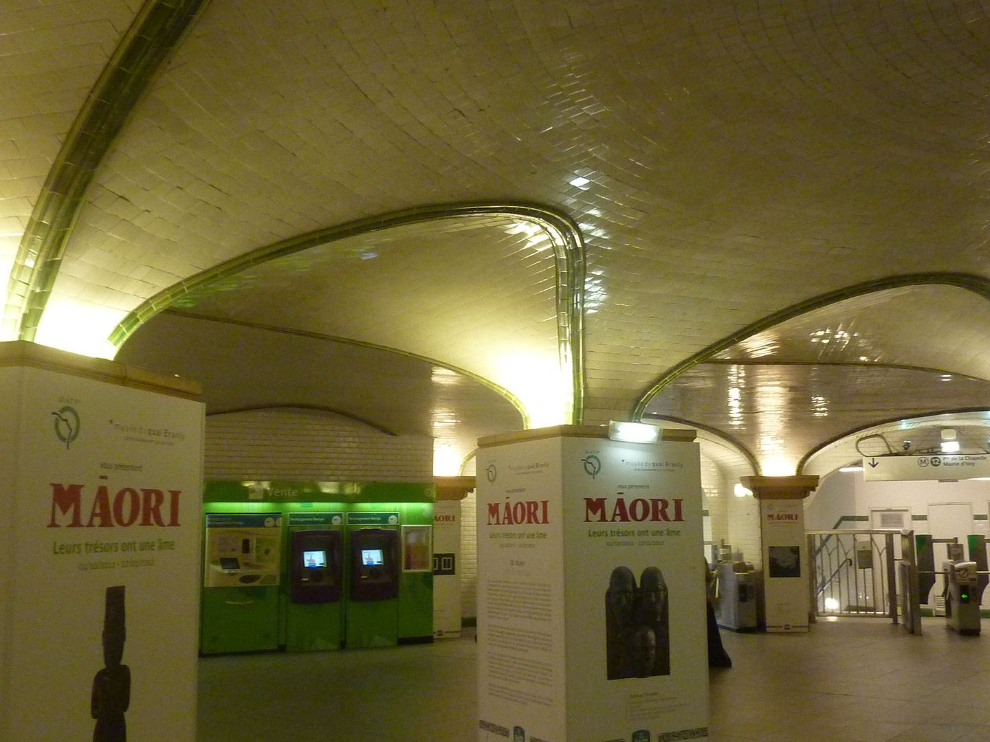
That is a really cool mosaic. But why doesn't the city of Paris send us a Guimard metro entrance? I think people would like that. I remember reading about France giving the U.S. a big statue once, and it was a big hit. Love the Cour de Rome metro entrance, very modern. That rotunda looks pretty nice for being a hundred years old. Just curious, what are the Maori signs for? An exhibit? |
|
|
|
Post by Deleted on Oct 12, 2011 22:51:32 GMT
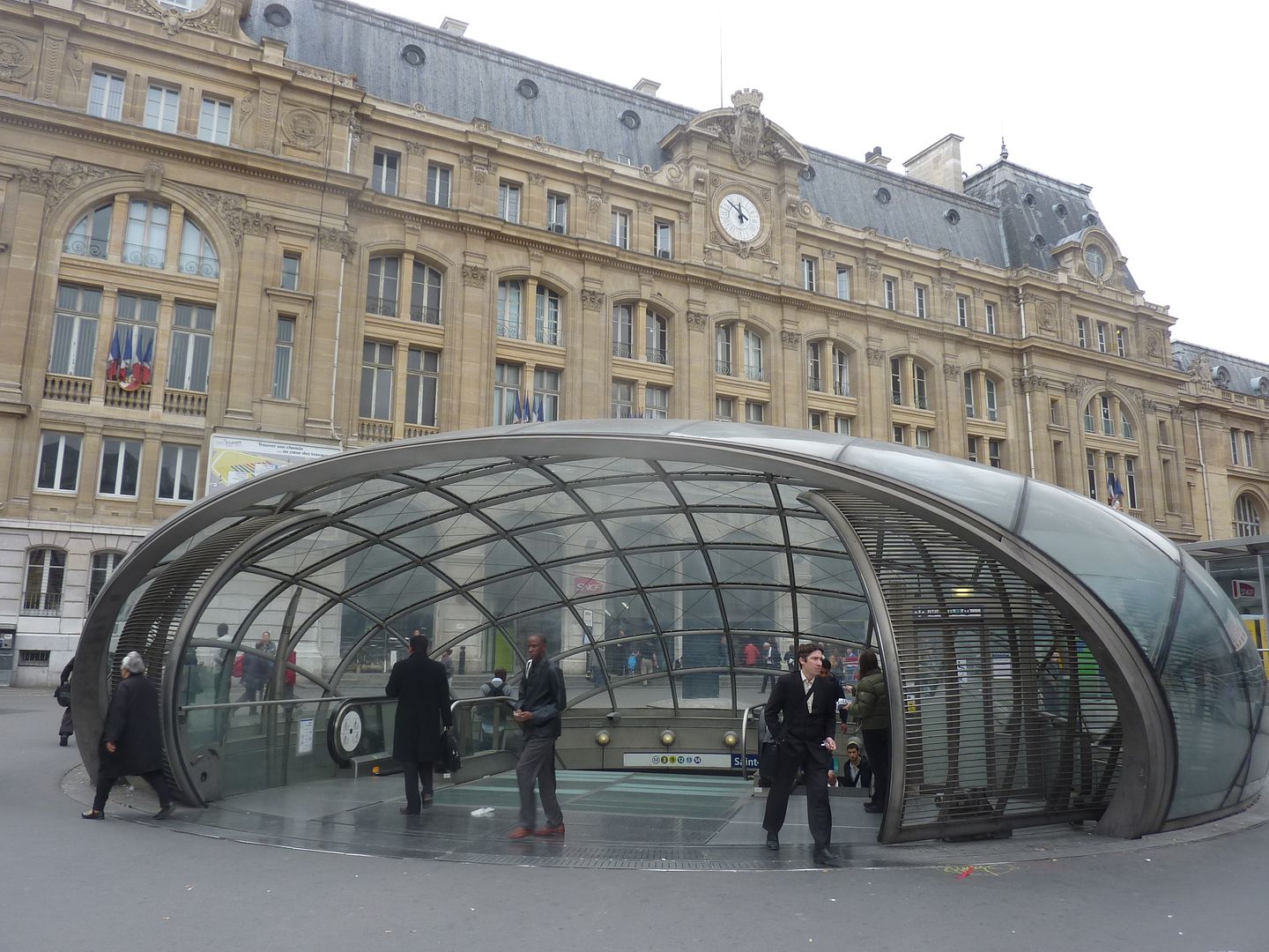
It's an current exhibit at the Quai Branly museum which tourists have not yet discovered -- it is the only national museum in Paris where local residents still outnumber the tourists who go there. The Guimard entrance at Square Victoria in Montréal is the only original entrance that has been given to another city. However, there are copies of a Guimard entrance in subways of the following cities: Mexico City, Chicago, Lisbon and Moscow. Maybe New York will get its chance some day. Montréal 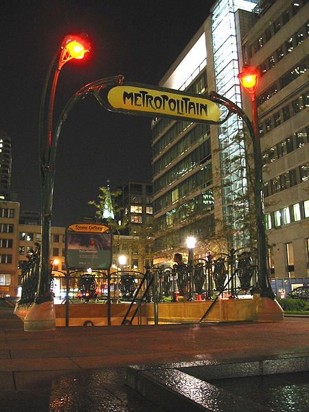 Moscow 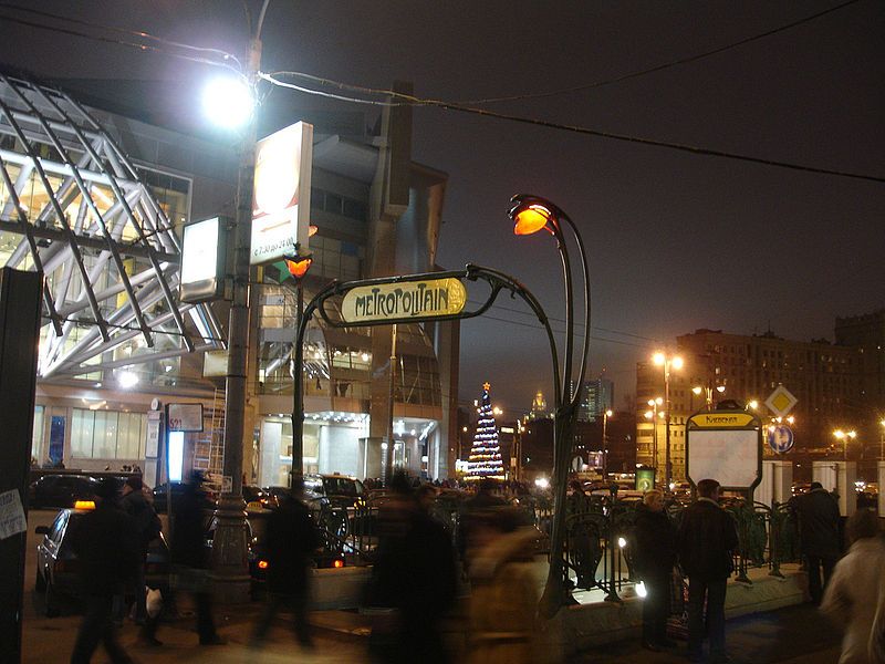 Mexico City 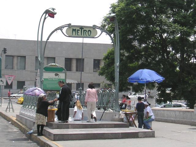 Chicago 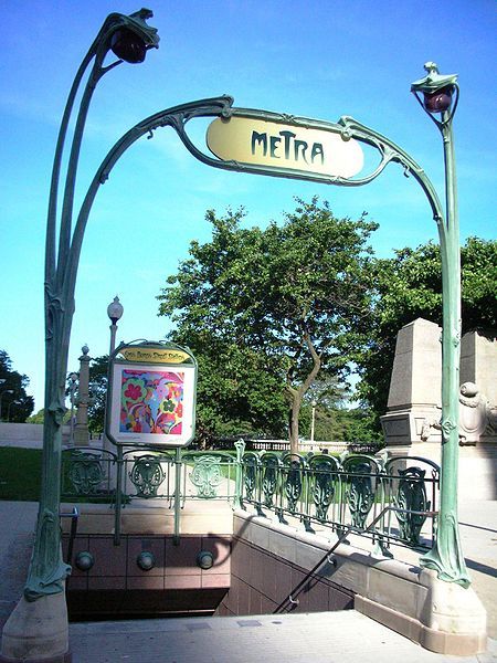 Lisbon 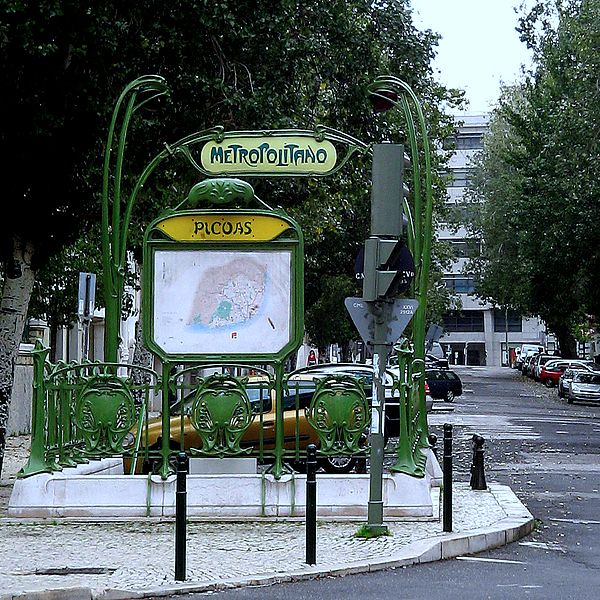 |
|
|
|
Post by koloagirl on Feb 24, 2012 3:38:10 GMT
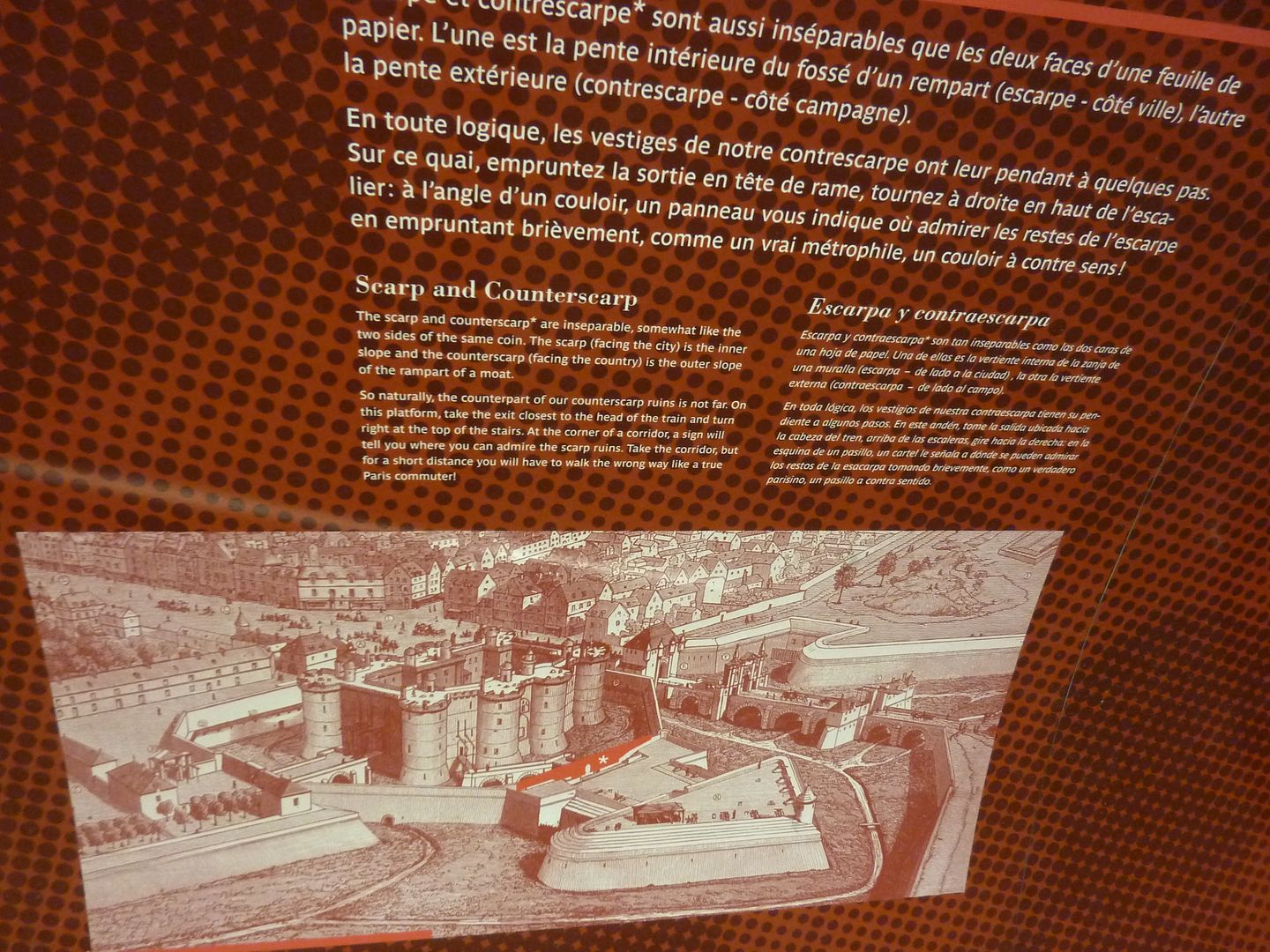
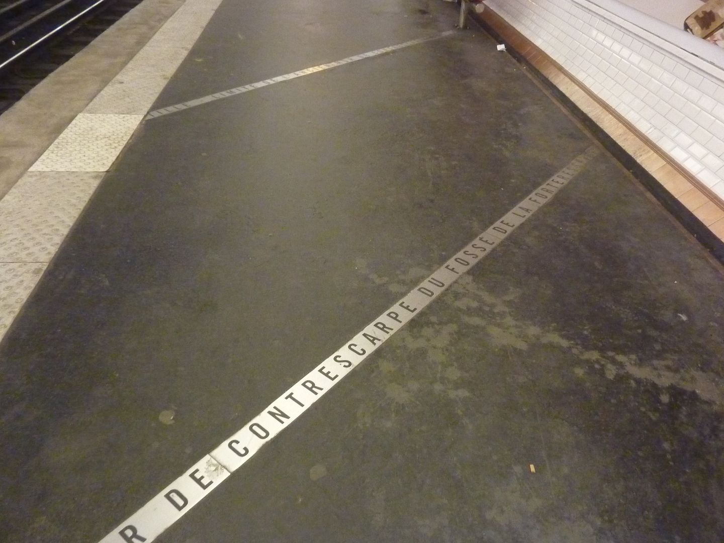
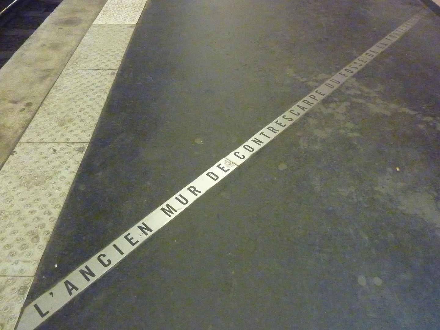
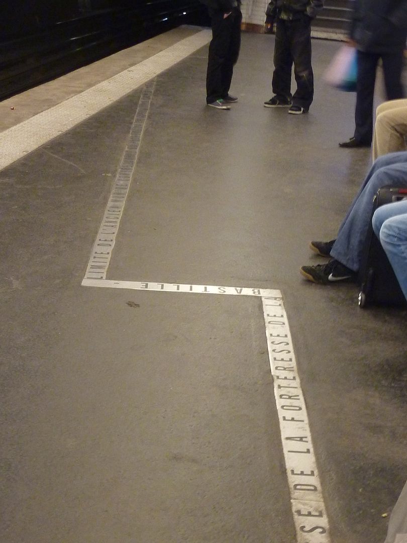
;D Aloha from Kaua'i! I know this is an old thread, but I'm so enjoying the photos (again!) of the various Metro stations - starting to anticipate my September trip I guess!  And you know, when I saw that unremarkable looking stone at the Metro station last Sept. that actually is part of the original "Bastille" - with no signage on it - I knew what it was due to this thread - so a very long overdue "merci" for that info - it was so fascinating! Malama Pono (take care) Janet  |
|
|
|
Post by Deleted on Feb 24, 2012 5:57:49 GMT
I need to go back to the Bastille station soon, because I saw that the informational signage is now back up. Meanwhile, still nothing happening at the Louvre-Rivoli station which has clearly been left on the back burner.
|
|
|
|
Post by koloagirl on Feb 24, 2012 6:15:40 GMT
Aloha from Kaua'i!
Wow, something that Kaua'i and Paris have in common then - public works that get put on the "back burner" - lol! ;D
It will be interesting to see the new (for me) signage for the Bastille stone when I come back in September.....I just found that so amazing to see....
Malama Pono (take care)
Janet
|
|
|
|
Post by lagatta on Feb 24, 2012 19:17:07 GMT
An interesting aspect of Geneviève Cadieux's artwork is that it is a photo of her mother's mouth (another meaning for "La Voie lactée" (the Milky Way). It is the mouth of a mature woman who thinks being chic and painting one's lips are still important!
|
|
|
|
Post by Kimby on Feb 24, 2012 21:48:15 GMT
I think I remember the San Michele (sp?) station as having an ornate art deco entrance, no?
|
|
|
|
Post by lagatta on Feb 25, 2012 1:07:08 GMT
If you are talking about Paris, that would be St-Michel.
|
|
|
|
Post by Kimby on Feb 25, 2012 15:10:13 GMT
Thanks, lagatta. That's the one. I think. K2, does it have an ornate entrance? Is it the one on the square with the fancy fountain?
|
|
|
|
Post by Deleted on Feb 25, 2012 15:40:19 GMT
It has perhaps one art deco entrance and the other entrances are Dervaux entrances. |
|
|
|
Post by Deleted on Feb 26, 2012 12:12:24 GMT
|
|
|
|
Post by nycgirl on Feb 26, 2012 22:54:26 GMT
Fascinating. And they did a fine job on presentation.
|
|
|
|
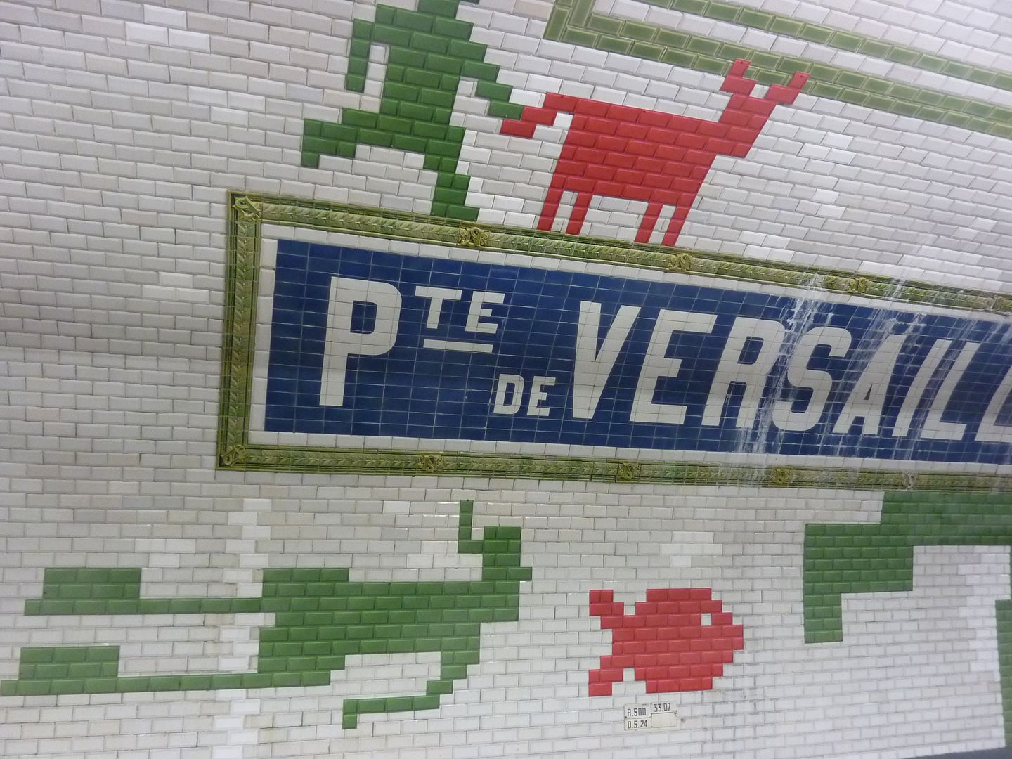
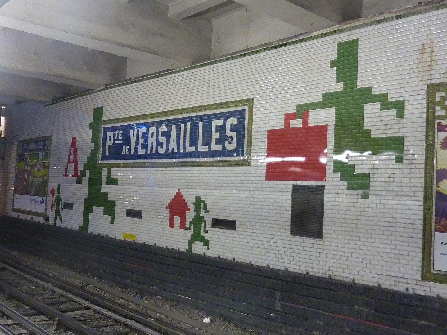
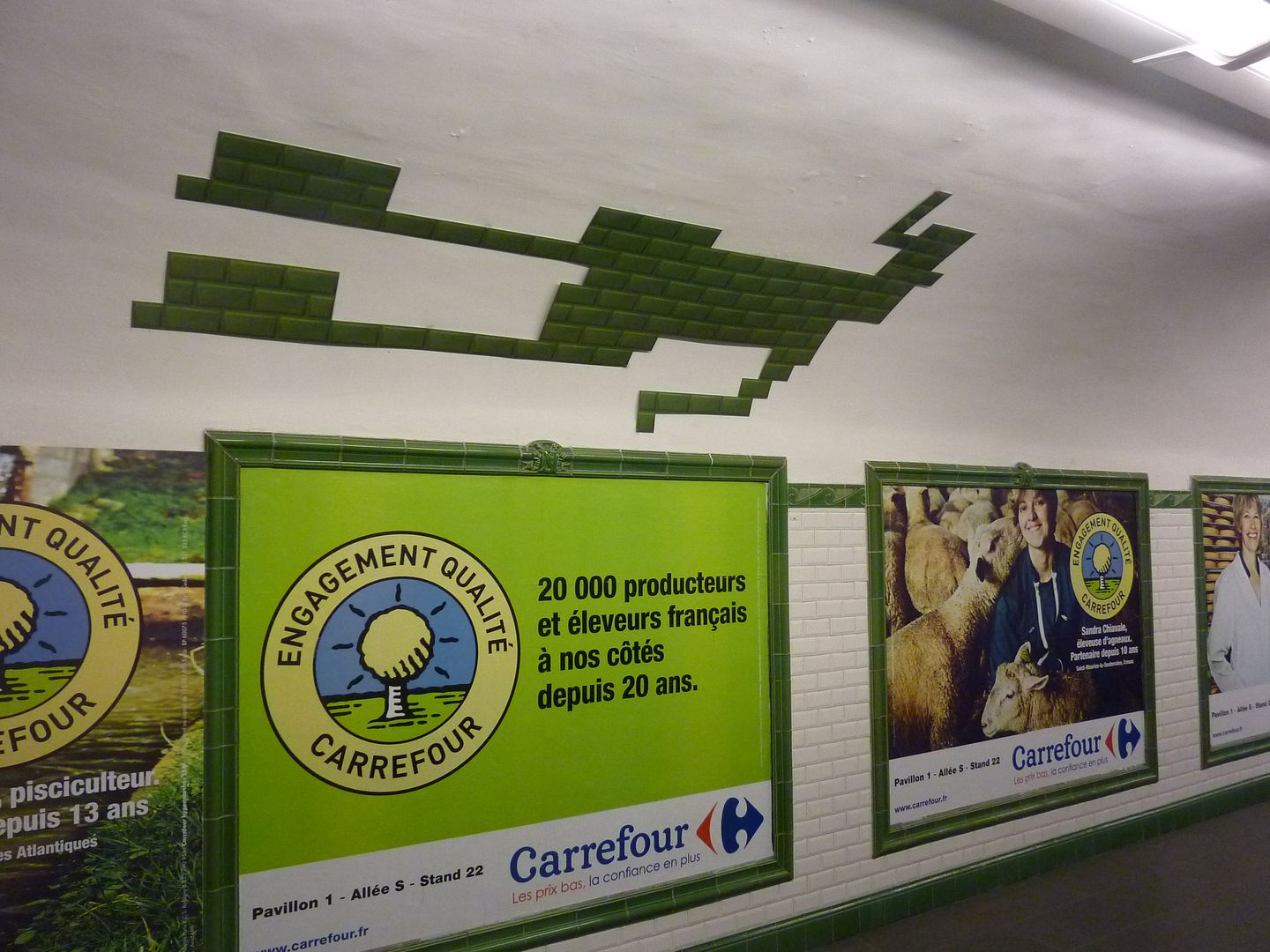
Post by Deleted on Feb 27, 2012 18:11:13 GMT
At the Porte de Versailles station (line 12), they merely did a variety of playful things with the traditional tiles. |
|
|
|
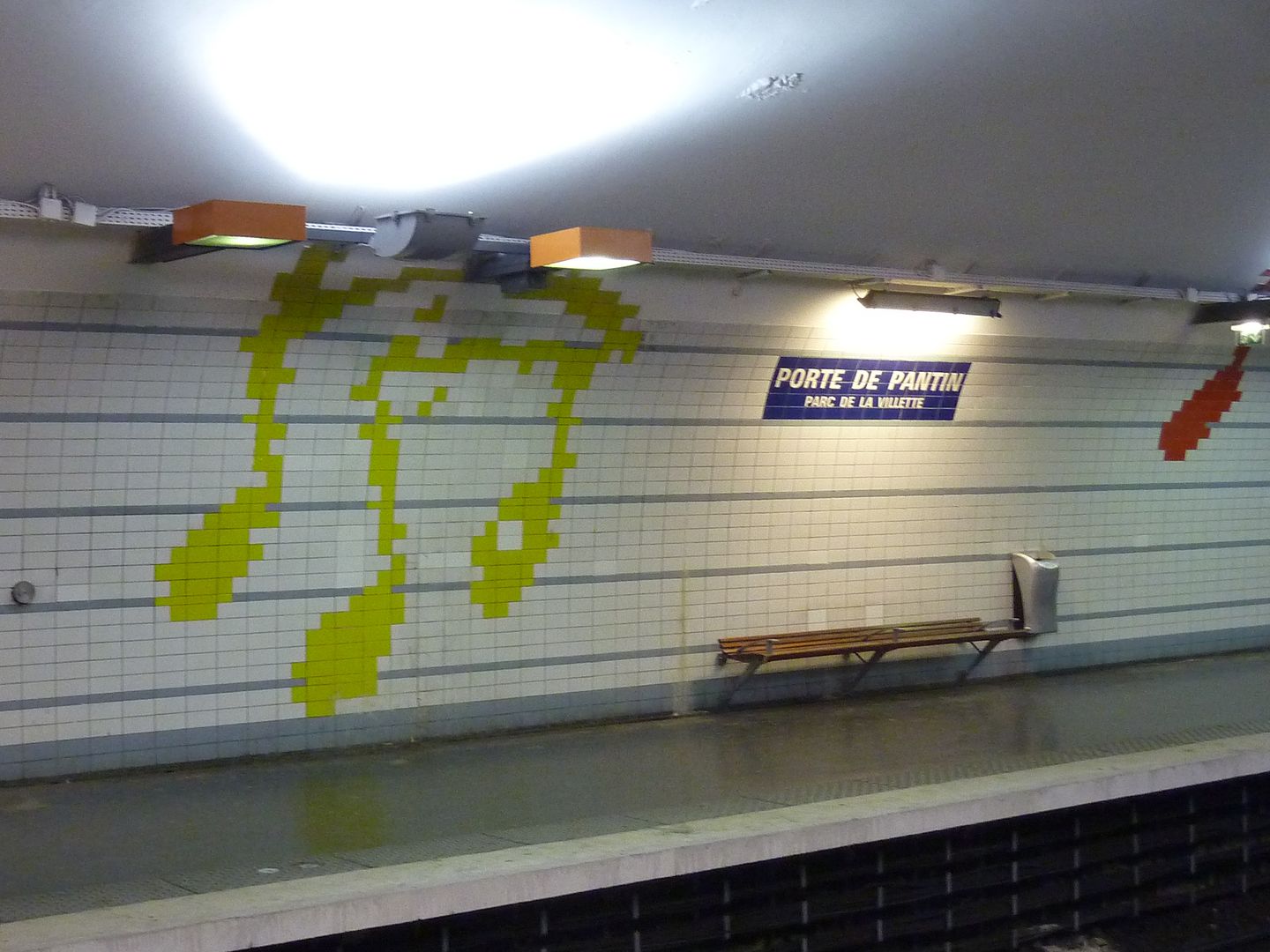
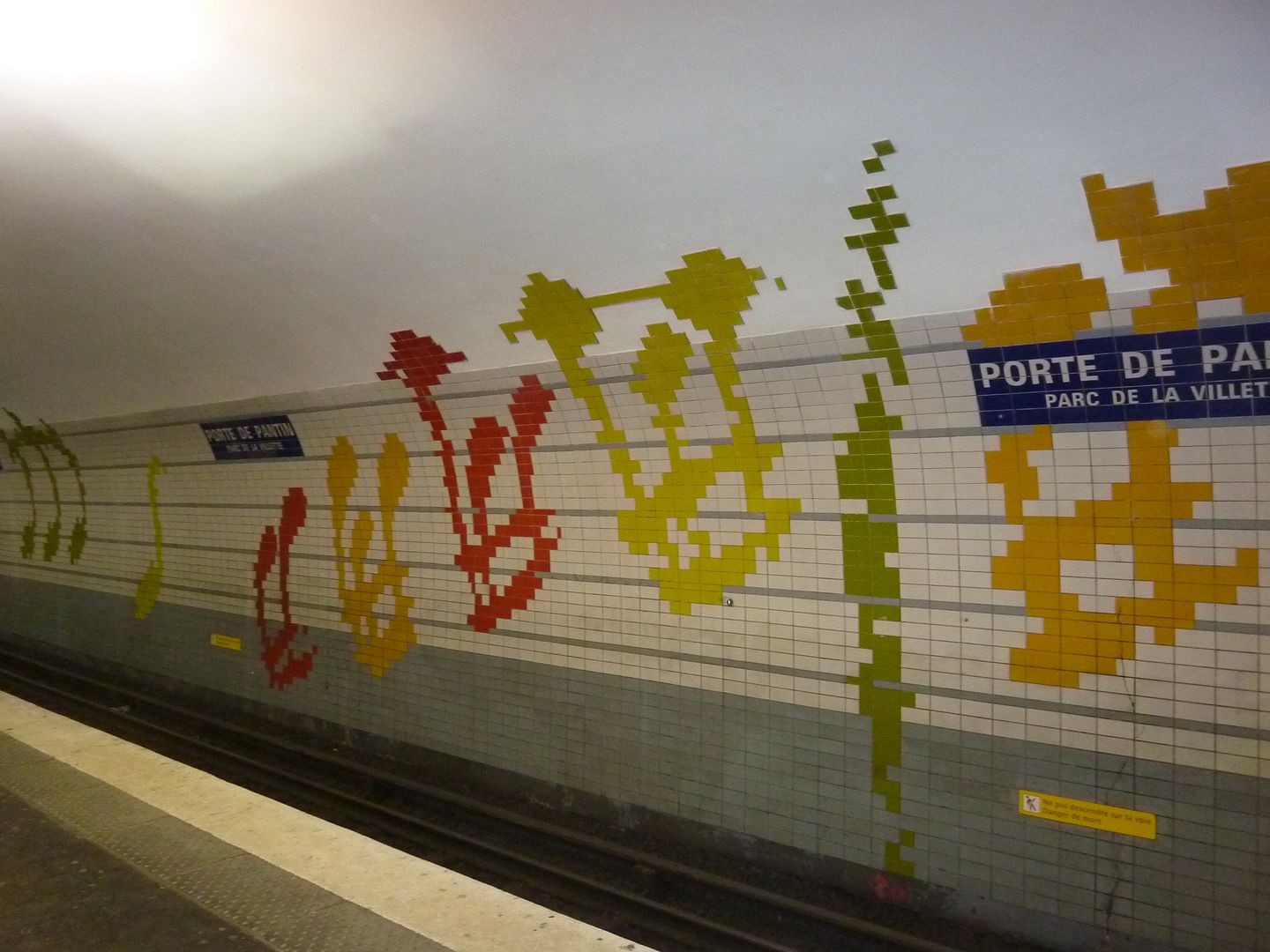
Post by Deleted on Mar 2, 2012 19:18:39 GMT
Another station with artistic tiles is Porte de Pantin, which has notes of music on the walls. It is the location of the Cité de la Musique and the future home of the Paris Philharmonic. |
|